2nd Presidential Years Are Different

Free Chart In Focus email
Delivered to you every week
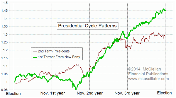
By now most who follow the stock market know that the first two years of each presidential term are basically flat, but the good times come in the 3rd year which is nearly always an up year. What a lot of people do not know is that it matters a lot in the 2nd year whether you have a first term president or a second termer.
This week's chart helps to make that point. To create each plot, I took the historical data for the SP500 (or its predecessor the Cowles Index) going back to 1936 and chopped the data into 4-year chunks, starting at the beginning of November in each presidential election year. November is when the election is, and my assumption is that the market starts reacting to the results of the election as soon as those results are known, rather than waiting until the victor is actually inaugurated.
With the data chopped up into those 4-year chunks, I then adjust each period to fit a uniform calendar. This is necessary because up until 1952, the stock market used to trade on Saturdays. And then in the summertime in the 1960s, the NYSE used to shut down on Wednesdays so that the clerks could get caught up on all of the paperwork for the increasing volume of trades. Then I would reset the daily values in each 4-year chunk to reflect the percentage change since the beginning, the better to average them all together.
For this week's chart, there is one additional step, which is to segregate the 4-year chunks of time into groups based on whether the president was in a first or second term.
Why is this necessary? The stock market tends to behave differently depending on whether there is a new president from a different party than the last one, or a reelected incumbent. Generally speaking, a 1st term president tends to spend a lot of time during his first two years "discovering" that conditions are even worse than he told us during the campaign, and proclaiming that the "only solution" is whatever package of tax hikes/cuts or spending boosts/reductions he is proposing. Investors generally get discouraged upon hearing that things are worse than previously thought, and that shows up in the movements of stock prices.
An incumbent who wins reelection generally does not spend as much time blaming the guy who preceded him, and gets on with continuing what he was doing. And the stock market responds accordingly.
By the 3rd year, those differences are gone, at least according to the historical record, and the stock market generally behaves in a similar fashion regardless of what type of new or old president is in office. We'll get to the 3rd year of this current presidential term in a few more months, but first we have to get through the unusual period in the summer of the 2nd year.
With a first term president in office, the market typically sees a price peak in November of the first year, and then a decline into the summer of the second year. That summer bottom typically leads to a rally into autumn, and continuing right into the 3rd year.
But the 2nd year is almost the exact opposite with a 2nd term president in office like we have now. The market typically reaches a peak in July (not in May, as so many believe), and then drops for the rest of the summer toward a September low.
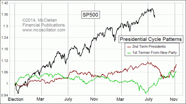
To help see the difference, here is a chart showing both of these versions of the Presidential Cycle Pattern and comparing them to the action in the SP500 since the 2012 election.

It quickly becomes obvious that the current market action is behaving a whole lot more like the average pattern for 2nd term presidents, which is as one would expect. The magnitude of the movements has been greater than average, which is also normal, and not all that remarkable. The Presidential Cycle Pattern and its variants are much more useful for telling us about direction than about magnitude.
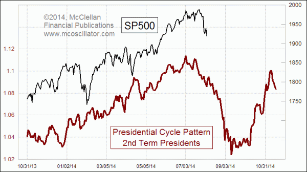
Here is another version, showing only the 2nd termer version, and zooming in closer on just the most recent data:

It shows that the steep drop which began from the July 24 top is happening pretty much on schedule. A brief pause in the decline is due over the next few days, and then a resumption of the decline should appear. The ideal bottom equates to around Sep. 10, although the bottom to go up out of does not appear until a month later.
A few months from now, we'll get to the bullish conditions of the 3rd year of a presidential term. But the market has a less than bullish period to get through first.
Tom McClellan
Editor, The McClellan Market Report
Nov 05, 2010
Entering the 3rd Presidential Year |
Sep 27, 2013
Seasonal Pattern |
Jul 24, 2014
A-D Line Divergence Again |