Seasonal Pattern
Free Chart In Focus email
Delivered to you every week
Much is made of seasonality in the stock market, and especially of September's evil reputation. That reputation is well-deserved, although it is not fully authoritative. So far, September 2013 is acting stronger than your average bear. But September is not yet over, and its effect can also extend into October.
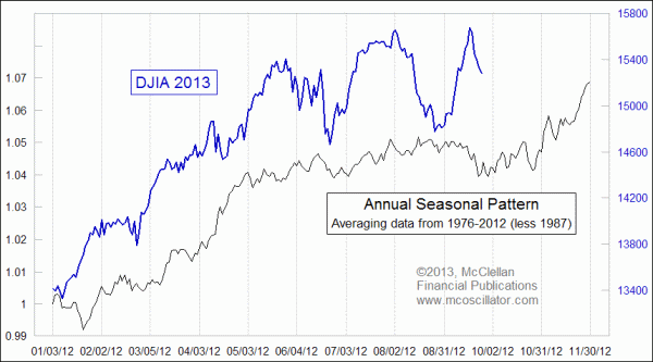
There are lots of ways to measure and express seasonal tendencies. In the chart above, the DJIA's Annual Seasonal Pattern is created from averaging together multiple years of the DJIA's behavior. But since the DJIA is at a different price level every year, using an average of the DJIA's actual values would inappropriately skew the result by overweighting the years when the DJIA was at a higher level. So to correct for that problem, I reset each year's price history to begin at a value of 1, equating to where the DJIA was on the first trading day of the year. Then each day's values for the rest of the year reflect the percentage change from that first day of the year. This way, each year's price history is more fairly weighted.
Here is what all the years' patterns look like. I call this sort of chart a "Rapunzel" diagram, after the mythical princess who let down her tangled locks.
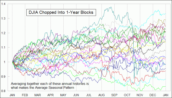
I also made one more adjustment, which was to simply just throw out 1987. Excluding data should not be done lightly, lest such an exclusion actually skew the results. But the magnitude of the huge rally in the summer of 1987 and the subsequent crash in October 1987 both tend to skew the overall average to an unacceptable degree. So in the same way that in Olympic ice skating they throw out the outlier scores, leaving out the history from 1987 actually makes for a more representative pattern of average seasonality.
The result is not perfect, and it never can be perfect. The market is rarely "average"; it just approximates the average pattern, with significant variation with each annual iteration. Still, there is an obvious correlation this year between how the pattern says it should go, and how the DJIA has actually traced out its seasonal dance steps.
One big problem is that September is supposed to be a weak month, but there was a huge spike upward to a top Sep. 18, caused by both the anticipation of the FOMC's actions and the response to the decision not to "taper" back from the $85 billion a month of extra stimulus. That action and the market's response could be viewed in at least a couple of different ways. The first is that the Fed's stimulus may have altered the normal course of the river, with all of that extra money changing things in a fundamental way.
But a second way of looking at this is that the market's anticipation and response to the Fed's action took prices well off track, and that the market's mission is to get back on track. The further that prices wander off track, the harder they have to work to get back on track. In simpler terms, the stock market went up when it was supposed to go down, and now it must pay the price for wandering off course. That was certainly the case in 1987, mentioned above, when the market went well above its normal track in the summer, and had to work extra hard in October 1987 to get back on the path.
The seasonal weak period does not end until late October. That's the old saw about "sell in May and go away" (and then come back in November, which is not as poetic and so it gets left out of the old saying). So in other words, the stock market still has until late October, on average, to finish getting itself back on track with what it is supposed to be doing during the normal seasonal weakness period.
Tom McClellan
Editor, The McClellan Market Report
May 04, 2012
A Seasonal Quandary |
Nov 05, 2010
Entering the 3rd Presidential Year |
Oct 12, 2012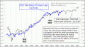
40-year Cycle In DJIA |