40-year Cycle In DJIA
Free Chart In Focus email
Delivered to you every week
Many cycles analysts talk about the "long cycle" of the stock market being the 54-year Kondratiev Wave, named for the Russian researcher who wrote about long economic cycles in 1925. My own research shows that it is a 40-year period which matters more for the stock market. The 40-year period also shows up in other economic events like gold rushes, real estate bubbles, and economic wars.
The stock market has had important bottoms in 1861 (Civil War), 1903 (Rich Man's Panic), 1942 (WWII), and 1982 (Cold War climax). There were also other important bottoms along the way, but these were the bottoms which match up with the 40-year cycle. Perhaps more importantly, these were the bottoms that the market went up from, as opposed to the rogue wave sorts of bottoms that merely see a return to the old equilibrium.
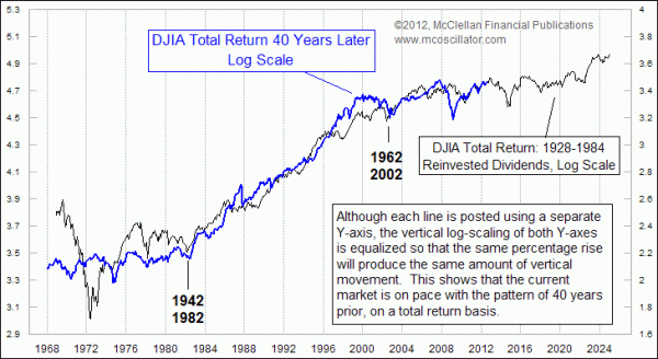
The bull market of the 1980s and 1990s was stronger than earlier ones if measured just in nominal changes to the major indices. But it was similar to the bull market of the 1940s and 1950s when we account for differences in dividend payments. This week's chart helps us to see that point. It compares the performance of the DJIA with dividends reinvested (total return) for two different periods, with the 1942 and 1982 bottoms aligned.
The scaling on the chart is logarithmic, which allows us to better compare the two price series which would otherwise look like parabolic up swings if posted on a chart with arithmetic scaling. The vertical scaling of each Y-axis is equivalent, so that similar percentage price moves get equal treatment.
The first interesting observation is that the patterns of price movements match up fairly well between the two price plots. There are some obvious anomalies; the crash of 1987 did not have an analog in 1947, but it did help bring the price plot back down onto the path of the earlier one after a big upward excursion in the DJIA before that year's crash. Similarly, the big decline in 2008 was much bigger than anything in 1968, but afterward the 2009 recovery brought the DJIA back up onto the earlier price plot.
In fact, right now the two plots are almost exactly overlaid on the chart, and that is perhaps the most interesting point of all. The total return for the DJIA from the 1942 bottom to 1972 matches the total return from the 1982 bottom to present. The nominal returns were different, meaning that if you just took the raw index values you would get a different result. But when we factor in dividends, the total returns have been almost identical.
Coming up, the earlier plot shows that the big decline of 1973-74 is the next item on the agenda. But we should remember that the market was driven downward extra hard in 1973-74 due to the combined effects of the Arab Oil Embargo of 1973, and the Watergate scandal and impeachment talks in 1974. And it did not help that the Federal Reserve in 1973 responded to the price inflation from the oil embargo by raising short term interest rates to over 10%, making things even harder for stocks.
So we may not see a dip in 2013-14 that is as severe as the one 40 years before, if we do not have similar exacerbating factors. But this portion of the 40-year cycle schedule does suggest that it will be a less-than-bullish period.
This notion of the 2010s being a repeat of the "lost decade" that we saw in the 1970s and also the 1930s is not a new one, and in fact it will be the main theme of an all-day seminar on October 19, 2012, being put on in Seattle, WA by the Market Technicians Association. I will be one of five guest speakers at that seminar, and will participate in a panel discussion. There is still room for people to sign up, if you can make it to Seattle that day. The event is free for MTA members, and $50 for non-members.
You can get all of the details here. If you are not an MTA member, you will need to call the MTA office at (646) 652-3300 to sign up.
Tom McClellan
Editor, The McClellan Market Report
Jan 15, 2010
Stock Market Repeating the Sideways 70s |
Aug 27, 2010
60-year Cycle In Interest Rates |
Dec 10, 2010
After The Rogue Wave |