After The Rogue Wave
Free Chart In Focus email
Delivered to you every week
One of the stories in the news lately is about a cruise ship that got hit by a rogue wave while sailing between Argentina and Antarctica. The wave was much bigger than all of the other waves on the sea's surface at the time. It knocked out windows on the ship, and disabled one of its engines.
The financial markets have rogue waves as well. And my study of the subject shows that the behavior of the markets' rogue waves closely resembles the physics of rogue waves in the ocean.
You can get a good primer on the topic of rogue waves in a Wikipedia article. One of the interesting findings is that they can occur in any medium where wave action is present, not just the ocean. They have even been observed in the transmission of light waves through fiber optic cables.
The basic idea is that in a sea state that already has wind-driven waves, every once in a while a wave will rise up, borrowing energy from adjacent waves to reach a crest height much higher than the waves around it. And perhaps most importantly, there will be a deep trough adjacent to the wave; the depth of that trough below sea level will be approximately the same as the height of the crest. After the rogue wave passes, the sea state returns to "normal", with the waves going back to their average height.
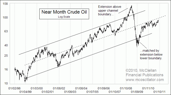
This week's chart shows a recent example of this principle in the financial markets. We all remember crude oil prices zooming up to $145/barrel, and then crashing down to $35. But to equate this action to what happens in the ocean, it is hard to come up with the idea of "sea level" for oil prices. There is no fixed flat price that is the "normal" price for oil, as it has been in a long uptrend over the decades since humans first started using and trading crude oil.
To address that idea of a "sea level", I used the trend channel draw into this log-scaled chart. The mid-point between the upper and lower channel lines makes a reasonable replacement for the role of "sea level". By that I mean that the amount of the extension above that line at the peak was matched by the depth of the price trough.
Notice also that before the big run up to $145, there had been a pretty normal "sea state" in oil prices, with oscillations from highs to lows in oil prices looking similar in magnitude. Beginning in 2007, that cyclicality seemed to leave the oil market, as the trend higher smoothed out to nearly linear. It was as if all of the energy normally manifested in that cyclicality was being fed into fueling the advance. This is similar to the way that rogue ocean waves "borrow" energy from the surrounding waves.
As oil prices have rebounded from the bottom at the end of 2008, oil prices have returned up to the median line, and the normal cyclicality is returning to oil price movements.
For an older example of this principle, the chart below looks back at the 1929 bubble top for stock prices and subsequent collapse.
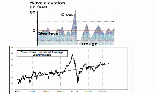
The upper plot in this comparison is an actual wave height plot measured by the Maxwave project, and I am comparing it to the structure of the famous 1929 bubble and subsequent collapse. Once again, "sea level" is modeled by an upward sloping regression line as opposed to a flat ocean. The height of the crest above that line was equaled by the depth of the trough below it. And once prices returned to that regression line, the market's normal cyclicality returned.
The movements of stock prices in the late 1930s and 1940s did not have much relation at all to the crest of the 1929 high. Instead, as the stock market returned to a normal sea state, the more recent pricing had a lot more to do with where stock prices went than did the 1929 top. This is an important lesson to remember as we think about crude oil prices in the future. The $145/barrel peak was an interesting historical footnote. But it does not have very much at all to do with where prices go from here.
Tom McClellan
Editor, The McClellan Market Report
Oct 14, 2010
Gold Prices Lead The Way For Commodities |
Feb 26, 2010
Oil’s Leading Indication for Stocks |
Aug 27, 2010
60-year Cycle In Interest Rates |