Using the TICK Intraday

Free Chart In Focus email
Delivered to you every week
Last week, I wrote about using the closing value of TICK as an indicator of short term overbought and oversold conditions. This week, I want to introduce you to a couple of ways that I like to use TICK on an intraday basis to see what the market is doing, and see when an intraday reversal is likely or even already underway.
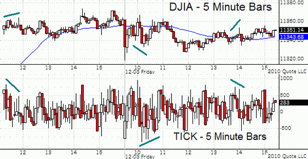
The first chart looks at TICK on a 5-minute basis. I like using a candlestick chart option for this, but one can just as easily use a standard OHLC bar chart. You can see that within each 5-minute period, the TICK covers a large distance. It is not unusual for most of the 5-minute bars to span from -500 to +500.
When you see a surge to beyond +/-1000, that is a more extreme gush of money coming into or out of the market. As such, those +/-1000 extremes can mark climaxes of buying or selling pressure, but there can be several such climaxes within a trading day.
Even more important than a climax value is when you see a divergence between price and the TICK. That shows a loss of energy for the move, and is a good setup for a reversal.
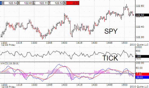
Because the TICK can span such a wide range of values within 5 minutes, it can be useful to zoom in on even smaller time increments. The next chart uses a 1-minute time increment for both the TICK and the prices of SPY, the ETF linked to the SP500 Index. At the bottom of the chart is a McClellan Oscillator of sorts. The regular McClellan Oscillator looks at the daily difference between advances and declines on the NYSE. Here, we are substituting the 1-minute TICK values for the daily A-D.

These charts were prepared in QCharts, but most modern charting programs should be able to handle the same operations pretty easily.
To create the TICK's 1-minute McClellan Oscillator, I just added a "study" to the chart of the 1-minute TICK, in this case MACD. Rather than using the program's default 12 and 26 period parameters, I reset them to 19 and 39, and I specified exponential moving averages as opposed to simple moving averages. Using 19 and 39-period EMAs tells the computer to use the same 10% and 5% smoothing constants used in the McClellan Oscillator.
The red line is a 9-period EMA of the blue MACD line. Crossing that red line makes for a good "buy" or "sell" signal, especially if the blue MACD line has already made a divergent top relative to price.
You can also see that reading at +/-100 show an extended short term condition for the market, but reversals can appear at much less extended readings.
Trading on a 1-minute bar chart is certainly not for everyone. But having a tool like this already built in your charting program to look at during the day can be helpful to traders with a longer time perspective. Suppose you were about to make a trade for reasons independent of this indicator, and you just need to know when to pull the trigger. Taking a look at the 1-minute TICK's McClellan Oscillator can tell you what the momentary trend is. If it is showing that the market is in a downtrend but not yet oversold, maybe you will decide to wait a few minutes and perhaps save a couple of pennies on the entry.
This is by no means an all-inclusive look at using the TICK intraday. I encourage you to build the TICK's 1-minute McClellan Oscillator in your own charting program, and study it yourself to see how it might be useful for your way of looking at the market. You can even tweak the time increments or indicator parameters to see if it behaves better for you.
Tom McClellan
Editor, The McClellan Market Report
Nov 26, 2010
TICK: Not Just a Bloodsucking Insect |
Jun 18, 2010
All Time Record Low McClellan Oscillator |
May 07, 2010
What It Takes To Get The Oscillator To Zero |