SP500’s A-D Line at New High
Free Chart In Focus email
Delivered to you every week
I heard it claimed recently that because the SP500's daily Advance-Decline (A-D) Line is making a new all-time high, that therefore breadth is strong and it is a positive sign for the stock market. But is that really true?
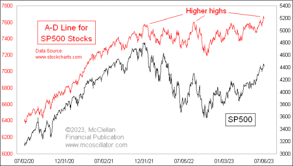
It is indeed factual that the SP500's daily A-D Line has made a new all-time high. But that is not necessarily a bullish development for the stock market, especially when breadth is weak elsewhere.
The whole point of even looking at an A-D Line is to get a different answer from what prices are saying, and hopefully a useful answer. In the A-D statistics, every stock gets an equal vote, unlike the capitalization weighted indices which are dominated by the top handful of stocks. The stocks which make up the SP500 are the big winners, the varsity team of the stock market. They are not the stocks that are going to give us the first message about liquidity turning bad. For that, we need to turn to the message of the less-deserving small cap stocks. That is why I prefer getting messages from the NYSE's A-D Line, which has proven itself to be more reliable over many years.
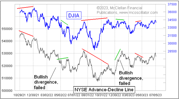
The NYSE's A-D Line in late 2021 was showing us a big bearish divergence versus prices, saying that liquidity was having problems. Those problems eventually came around to bite even the big cap stock indices. And it is still not looking that great now, especially compared to the SP500's A-D Line shown in the top chart, a difference which says that liquidity generally is not doing that well. What liquidity that is out there is being hogged by the big cap tech stocks, which are the ones that dominate the big-cap indices.
Years ago, I used to believe as others still do that the best A-D data was from the "common only" set of stocks. After all, they were the "real" stocks, and not contaminated by the bond closed end funds, preferred stocks, rights, warrants, SPACs, and other odds and ends that trade line stocks on the NYSE. But that belief changed once I looked at the actual data.
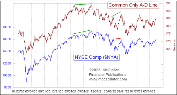
I calculate the A-D data myself for those several different flavors of NYSE-listed issues, and that allows me to create the Common Only A-D Line (and others). Having those data allows me to proclaim that the common-only data are NOT better, and can give misleading indications.
As the stock market was topping in late 2021, the Common Only A-D Line was still making higher highs all the way to early December 2021, saying everything was fine. Other measures of liquidity, however, were screaming that there were big problems. If one had listened to the Common Only A-D data, one would have been misled. the same thing happened in August 2021, when the Common Only A-D Line surged to a higher high, looking better than prices, but that was a bad message about supposed strength.
I also do not like to use the A-D Line for the overall Nasdaq market. It has such a bearish bias that its messages are functionally unusable.
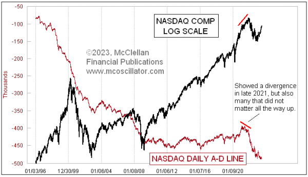
The Nasdaq exchange has much lower listing standards, and because of that the A-D Line for Nasdaq stocks has a tremendously bearish bias. And it always has. If a company is going to go public and go broke, it is more likely to do that on the Nasdaq. And every down day from the IPO price to zero will add to the Declines column of the data. Most technical analysts don't know that the Nasdaq's A-D Line has never (not once) made a new all-time high. It started downward from the beginning of the data in 1972, and has never gotten back to that level.
Because of this negative bias in the Nasdaq A-D Line, looking for bearish divergences is pretty much pointless, because they are happening all the time. It is like the Aesop fable about the boy who cried wolf.
The point of using any A-D Line is to have a canary in the coal mine, which will tell you about troubles before the bad gases accumulate to a high enough concentration to kill the big burly coal miners. The SP500's A-D Line is usually stronger than prices, so we never get that message from it. The Nasdaq's A-D Line is so weak that it is warning of catastrophe all the time. Neither offers useful insights in a consistent way.
One of the best and most reliable A-D Lines is the one using A-D data for high yield corporate bonds.
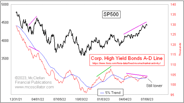
These issues drink from the same pool of liquidity as the stock market, and so when liquidity is strong they do great. When liquidity starts to dry up, they will often show that ahead of prices, which is the warning one hopes to get from using any A-D Line. Right now, the message is that the higher highs being made by the SP500 here happening without strong liquidity, in other words this is just coming from optimism and not from money. That is a problematic way to run an uptrend.
Tom McClellan
Editor, The McClellan Market Report
Feb 17, 2023
HY Bond A-D Line Showing Liquidity Problem |
Mar 31, 2023
A-D Data For Index Components Is Not Necessarily Better |
May 11, 2023
NYSE A-D Line Adds to the List of Divergences |