NYSE A-D Line Adds to the List of Divergences
Free Chart In Focus email
Delivered to you every week
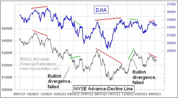
We have been seeing a lot of breadth divergences lately, and the granddaddy of them all is adding to that list right now. The Daily Advance-Decline (A-D) Line for the NYSE is making lower highs, which disagrees with the slightly higher highs seen recently in both the DJIA and the SP500.
This latest divergence since mid-April is a small one, but small divergences can still be problematic. In fact, this is one of the problems with A-D Line divergences, in that we never know how long they may persist before they finally matter. One other problem is that a divergence can sometimes get rehabilitated, which in this case would happen if the A-D Line were to suddenly get stronger, moving to a higher high to take away the bearish messages of the current divergence. That could happen.
The origin of looking at A-D data dates back to 1926, when Leonard Ayres and James Hughes of the Cleveland Trust Company together worked on amassing data on the daily breadth numbers, i.e. the daily A-D difference.

Ayres was an interesting guy, a retired Army colonel who served as logistician for General John J. (Blackjack) Pershing who led the American Expeditionary Forces deploying to Europe to fight in WWI. Getting men, horses, weapons, and supplies across an ocean to fight in a war was a new challenge for the U.S. Army. Ayres later went back on active duty briefly for WWII and promoted to brigadier general before retiring again for health reasons.
Working as a portfolio manager at the Cleveland Trust Company in the 1920s, Ayres teamed with James Hughes and wondered what insights they might gain from looking at the data on Advances and Declines, but no one until that point had figured out that divergences from the price action could be so important. That is rather a shame, because by 1929, there was a huge divergence evident between the movements of the DJIA, which topped in September 1929, and the A-D Line which had peaked more than a year earlier.
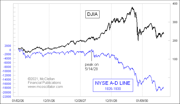
Even if anyone in 1929 had noted that divergence at the time, there was not the historical data then for anyone to evaluate what such a divergence could mean for prices. The A-D Line remained a relatively obscure indicator until 1962, when both Joe Granville and Richard Russell commented on it in their newsletters. They noted how it had shown a big bearish divergence ahead of the 1962 bear market, which saw a 27% drop in the DJIA.
.gif)
Finding something which could give advance warning of a bad market event like that got a lot of people's attention, and interest in the A-D Line really took off. Eventually that led to work by my parents, Sherman and Marian McClellan, who looked at exponential moving averages of the daily A-D data and developed what later came to be known as the McClellan Oscillator.
In 1962, one big criticism of the composite A-D data was that it was supposedly contaminated by the NYSE having a lot of insurance companies and utilities which were "interest sensitive", and not considered "real" stocks. But that supposed flaw may actually be a feature which makes the A-D Line work so well. Its purpose is to help identify liquidity problems ahead of when those problems come around to bite the large capitalization stocks which drive the major indices.
Every listed issue on the NYSE gets an equal vote in the daily A-D statistics, including the oddball ones like preferred stocks, rights, warrants, structured products, and even bond-related closed end funds (CEFs). Together these "uncommon" stocks make up about 40% of the listed issues on the NYSE, and while some analysts assert that they contaminate the overall A-D data, I have found that they actually serve to help improve its message. Those uncommon issues tend to be more sensitive to liquidity, either good or bad, and so they can show problems before the illiquidity comes around to bite the "real" stocks.
Some analysts will tell you that you should really just pay attention to the A-D data for the stocks which make up a major index, since those are the "real" stocks. I debunked that here back in March 2023.
I used to believe as others do, that the Bond CEF A-D data was a contaminant. But then I looked at the data, and it changed my mind. I now put in the work each day to calculate these data myself, because they are so useful. Here is that Bond CEF A-D Line:
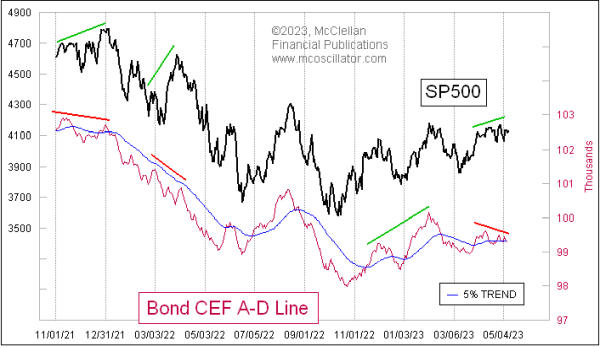
It is also showing a bearish divergence now, just like the composite A-D Line, and this comes after it was showing us some nice strength coming out of the price low back in October 2022. That change in behavior in the last few weeks says that liquidity has suddenly shifted to being a big problem for the stock market, one which should weigh on other stocks including the big-cap stocks that are still holding up the SP500 and the Nasdaq 100.
Tom McClellan
Editor, The McClellan Market Report
Mar 31, 2023
A-D Data For Index Components Is Not Necessarily Better |
Aug 27, 2021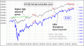
A-D Line’s Troubling Divergence |
Jan 13, 2022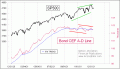
Bond CEF A-D Line Showing Liquidity Problems |