A-D Data For Index Components Is Not Necessarily Better
Free Chart In Focus email
Delivered to you every week
There is a belief that is held among some technical analysts that if you want to properly use data on Advances minus Declines (A-D), you should seek out “pure” data, such as A-D data for only the common stocks, or only for index components. This is an understandable belief system for people to take up, but it is not a useful one. It turns out this is a poor way to use A-D data.
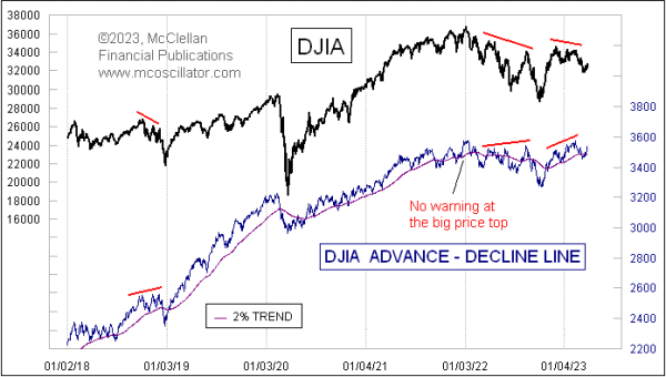
This week’s chart shows a daily A-D Line for just the 30 stocks that make up the Dow Jones Industrial Average (DJIA). I started tabulating these data myself years ago because I thought it could be valuable. I have found other ways to get useful insights out of the behaviors of the 30 DJIA stocks, but a daily A-D Line from them is not all that useful.
The whole reason why an analyst would ever want to watch an A-D Line is to hopefully get different answers than what prices are saying, and at useful moments. Most often this is in the form of a divergence versus prices, such as when you see prices making a higher high but an A-D Line makes a lower high. Based on this evaluation rubric, the DJIA’s A-D Line fails as an indicator. It almost never shows a divergence from what the DJIA itself is doing, and when it does it is usually wrong. A few examples are highlighted in the chart above.
Still, the belief persists among some analysts (who don’t actually check the data) that purified A-D data is somehow better than composite data. I prefer the composite NYSE A-D Line, as well as some of the more obscure A-D Lines like the one for high yield bonds, or for the bond-related closed end funds (CEFs) which are most often blamed for contaminating the NYSE composite A-D data. Those issues are the real canaries in the liquidity coal mine, and they will do a better job of showing liquidity problems ahead of when those problems affect the big cap stocks that drive the indices.
As an historical aside, good A-D data for the NYSE only exists back to 1926, which was when Leonard Ayres and James Hughes of the Cleveland Trust Company first started compiling it because they thought it might be interesting. Almost no one followed such data, though, until 1962, when Joe Granville and Richard Russell separately wrote in their newsletters about a big A-D Line divergence. Here is a chart of what they were seeing.
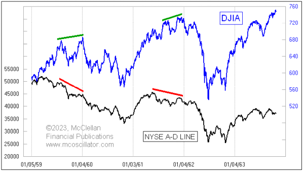
They pointed out how a big divergence occurred between the NYSE’s A-D Line and the DJIA, ahead of a 27% decline in the DJIA in the big bear market of 1962. It got a lot of people’s attention that there could be a warning sign ahead of such a big bear market, and so interest in trading the Advances and Declines data really took off in the 1960s, even leading to my parents taking up the study of it in 1968.
Richard Russell died in 2015, but I was able to speak to him about this a few years before he died. He noted that when he had mentioned the A-D Line in the early 1960s, a lot of people were dismissive of it because they claimed that the whole NYSE list included a lot of stocks in utilities and insurance companies, which were “interest rate sensitive”, and so they were not considered “real” stocks. This same argument persists today, and it is still misguided.
I have in recent years become particularly fond of the daily A-D Line for high yield corporate bonds. These are not even stocks, but they behave a lot more like the stock market than like T-Bonds, because they are subject to the same liquidity factors that affect stocks. When liquidity starts to dry up, these “junk” bonds will start suffering before the overall stock market does, and that is what makes watching them so useful.
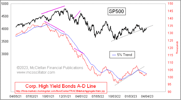
The SP500 is trying to climb back up on top of its broken rising bottoms line. But the HY Bond A-D Line is just barely making it back to its 5% Trend (AKA a 39-day EMA), meaning that these bonds that are super vulnerable to liquidity are not saying that liquidity is making a triumphant comeback. It still could make such a comeback, but it is not happening yet.
And the A-D Line for the DJIA offers us no such insights. So we should very kindly and gently let go of the people who tell you that you should use “pure” A-D data. They mean well, but they have not looked at the actual data.
Tom McClellan
Editor, The McClellan Market Report
Jul 19, 2018
The Supposed Superiority of Common Only A-D Data |
Mar 24, 2017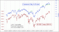
Why Don’t We Use Just Common-Only A-D Numbers? |
Nov 27, 2019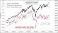
Nasdaq A-D Line Lagging, Does Not Matter |