Nasdaq A-D Line Lagging, Does Not Matter
Free Chart In Focus email
Delivered to you every week
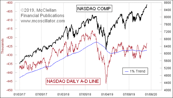
The cumulative daily Advance-Decline Line (A-D Line) for the Nasdaq is now finally making a slightly higher high than what it saw on Nov. 4, 2019. But it is still below the high made on May 3, 2019. And it is even further below the high made back on Aug. 31, 2018. Some analysts might look at these as “divergences”, and infer a bearish implication. But that would be wrong.
The problem is that the Nasdaq’s A-D data have an inherent negative bias, and this has been the case for most of the history of the Nasdaq market. The reason stems from the easier listing standards on the Nasdaq vs. the NYSE, which results in more companies listing their stocks there. If a company is going to IPO and then go broke, it is much more likely to do so on the Nasdaq. And every day that such a stock spends dropping from its IPO price to its delisting counts in the declines column. The result is the big negative bias we see in the Nasdaq’s A-D Line.
That negative bias can be even better seen by looking at a longer term chart. This one starts back in 1988:
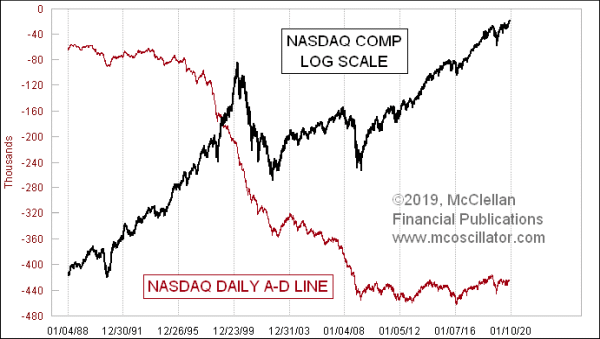
Back in the 1980s and 1990s, the Nasdaq Composite (COMPQ) kept on trending higher, even though the Nasdaq’s A-D kept trending lower. Along the way, one could have pointed to innumerable bearish divergences, none of which mattered until we got to March 2000, and prices finally had their blowoff top. So citing a bearish divergence back then was functionally useless as an analytical observation.
The same can be said for the price rebound off of the 2003 low. The A-D Line never confirmed that new uptrend, and yet the price uptrend continued anyway. Or at least we might say that it continued right up until it didn’t, and that this A-D Line was not much help in identifying when that moment was upon us.
I like to explain this point with a trivia question: When was the last time that the Nasdaq’s A-D Line made a new all-time high? This is a trick question, because it has never made a new all-time high. It started downward from the beginning of when the A-D data were first published in Barron’s in 1972, and the Nasdaq A-D Line has never made it back to that starting value.
The NYSE’s A-D Line is much more useful for showing us divergences which matter:
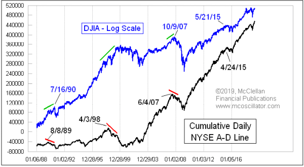
It does not give major divergent indications all that often, but when it does they tend to mark the price tops you’d really want to know about.
Examining the Nasdaq A-D data is not entirely without value. If one makes extra effort to look at the acceleration taking place in those data, using tools like the Nasdaq McClellan A-D Oscillator and Nasdaq Summation Index, one can sometimes get useful insights. But the better indications of liquidity, either good or bad, come from looking elsewhere. So one should not get fooled by supposed divergences appearing in the Nasdaq A-D Line.
Tom McClellan
Editor, The McClellan Market Report
May 09, 2019
JOLTS Data Stumble, but A-D Line Says Don’t Worry |
Aug 07, 2013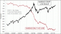
Nasdaq A-D Line Does Not Work As Well |
Oct 05, 2018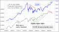
A-D Line Diverging |