A-D Line Diverging
Free Chart In Focus email
Delivered to you every week
We are now in the period of bullish seasonality. And we are just about to enter the bullish 3rd year of the current presidential term. So all signs should be starting to point upward now, after the normal weakness of a presidential term’s 2nd year.
One problem is that we have not seen that normal 2nd year weakness. Another problem is that just as things are supposed to start getting stronger, there are signs of weakening internals. Among the most troubling of these signs is an A-D Line divergence.
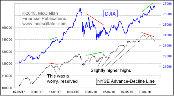
The DJIA has continued to make new all-time highs, and that is usually a bullish sign. Remember that it is only the last all-time high that is the bearish one, and along the way there are a lot of other ones that are not bearish.
The problem comes when there are non-confirmations such as the one we see with the NYSE’s A-D Line. It topped back on August 29, and has thus far failed to confirm the higher price highs of the major averages. That is not good news. But it is not necessarily fatal.
Divergences are among the trickiest chart developments to interpret. One big problem is that a supposed divergence can rehabilitate itself. If the breadth numbers start getting stronger, with many more Advances than Declines, then the A-D Line could possibly move higher and remove this evident divergence. But for now it is telling us that there are problems with the liquidity pool.
When liquidity starts to dry up, it does not show up in the behavior of the big cap indices. Rather, it shows up in the behavior of the stocks which are less deserving, like the weak animals which die first in a drought. Eventually the drought comes after the strong animals, but it kills off the weak ones first. So it is with liquidity problems in the stock market, which show up first as weakness in the A-D Line, and then later as weakness in the major averages.
At the moment, this current divergence between the A-D Line and the price indices is just a short-duration one. Small divergences lead to small price declines. The big bear markets tend to come after divergences lasting several months. Here is a chart showing some of the more notable long-term A-D Line divergences:
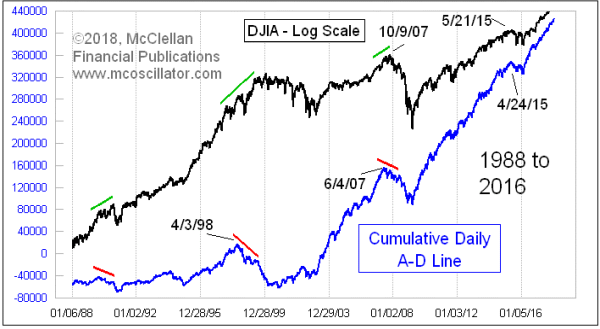
When an A-D Line divergence persists over several months, it foretells of a much more significant bear market that is to come. I’m talking about a divergence lasting 3 months or longer. Thus far we are not seeing that in the current instance, although we could get there. It will take more time.
In the meantime, the divergence has become more extreme, perhaps signaling that the breadth weakness has gone too far. The A-D numbers lately have been so bad that they may be saying things are good. The McClellan Oscillator measures acceleration in the A-D data, and on Oct. 4 it went to its lowest reading since March 23, which had marked the low for 2018 (thus far). A low reading like this can mark a momentary oversold bottom.
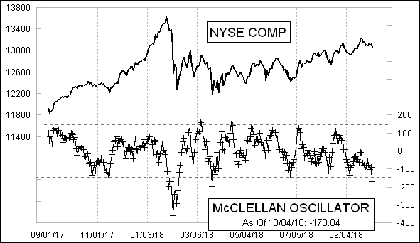
The McClellan Oscillator can of course go to an even further oversold condition, but a very deep reading like this is nearly always a sign of the market having declined to an overdone state. So even though we see a bearish divergence in the A-D Line, the bearish condition which it is telling us about may already be overdone. This is the problem with short term divergences.
Tom McClellan
Editor, The McClellan Market Report
Dec 19, 2013
A-D Line Divergence |
Jul 24, 2014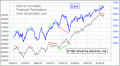
A-D Line Divergence Again |
Sep 28, 2018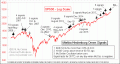
Ten Hindenburgs So Far |