A-D Line Divergence
Free Chart In Focus email
Delivered to you every week
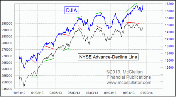
The Fed's announcement that the taper would be a more quiet retreat instead of a sudden one was celebrated on Wall Street, and it pushed the DJIA and other indices to higher highs. But so far, the NYSE's A-D Line has not followed suit. Maybe it will catch up in the days ahead, but for now we have a bearish divergence showing.
That is a way of saying that the higher price highs for the indices are being made with dwindling participation, and that is not generally good news. A-D data are perhaps the best "liquidometer", a way of finding out the state of the liquidity available to the stock market. Financial markets can suffer from many different types of problems, but liquidity problems are the toughest to get over. And in periods when liquidity is plentiful, as evidenced by a strong A-D Line, then the other types of problems are easier to get over. Plentiful liquidity means that even the least deserving stocks can garner some of it, and participate in the advance. But when liquidity gets tight, the big and popular stocks which dominate the indices can hog their share, while the runts of the herd get taken out behind the barn.
The daily A-D Line is constructed as a cumulative time series of the daily Advance-Decline difference, also known as "daily breadth". Each day, the number of advances and declines are published by multiple sources, although the various sources almost never agree (a source of longstanding frustration). We use Wall Street Journal numbers as our official final source for A-D data, although we consult other sources during the trading day. We calculate the difference between advances and declines, which can be either a positive or negative number depending on which side prevails each day. Then we add that daily breadth number to the prior day's cumulative A-D Line value. The scaling of the numbers on the Y-axis is not important; it just reflects what has happened in the time since one's chosen start point for the data.
Generally speaking, the A-D Line will look a lot like price indices, which is to be expected. It give us useful information when the breadth numbers start doing something different from prices.
The chart above shows that the DJIA (and other indices too) has pushed ahead to a higher high. But the A-D Line peaked on Oct. 29, 2013, and as of the close on Dec. 18, 2013, it is still 2700 increments below that October high. That sort of bearish divergence is not good news, although it does not necessarily have to bring the price uptrend to an immediate halt. Instead, it is a warning message that trouble may be brewing for market liquidity.
If the bearish divergence persists into 2014, then that could spell an even bigger problem for investors. Major market tops have typically followed divergent tops in the A-D Line by a period of 3-6 months.
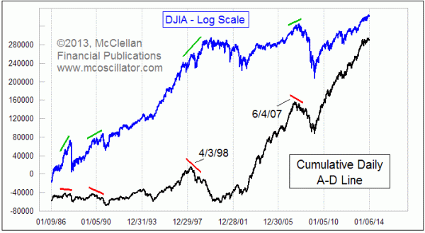
The composite A-D Line peaked on June 4, 2007, just over 4 months ahead of the final top for the DJIA. In 1998, there was an A-D Line peak on April 2, 1998, 3 months ahead of the July 17, 1998 top. That led to a 20% market decline in August 1998, and then we saw further trouble as the Internet bubble top in 2000 came with the A-D never giving confirmation of the new upward price move. That was a big sign of trouble, and trouble did indeed arrive in 2000-2002.
We saw similar big divergences between the A-D Line and the DJIA back in 1990 and 1987, before the severe price declines in those years. So if the current divergence we are seeing right now stretches into 2014, that suggests problems similar to those prior major bear market declines.
And the divergence is not just evident in the composite A-D Line. Many analysts say that we should only ever look at A-D data for the "common only" set of NYSE issues, since the preferred stocks, closed end funds (CEF), rights, warrants, and other special issues supposedly contaminate what those analysts see as the "real" data. I do not happen to agree with that prejudice, since my research has shown that those "uncommon" issues actually serve as a better canary in the coal mine, warning of trouble well ahead of time. The bond CEF A-D Line, for example, topped way back in May 2013, and it continues to show bearish divergences relative to prices.
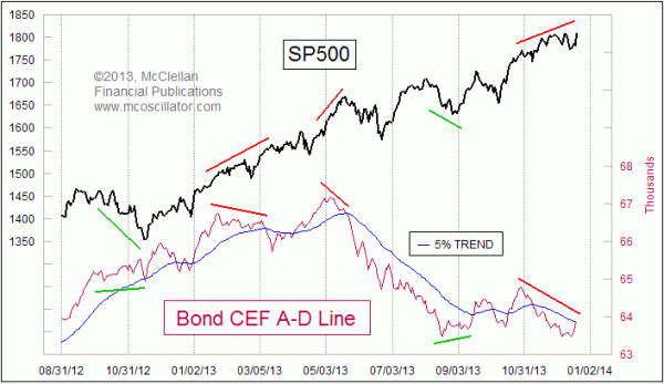
The Bond CEF A-D Line also gave an earlier warning signal ahead of the Oct. 2007 market price top, when the Bond CEF A-D Line topped back on May 11, 2007, almost a full month before the composite and "common only" A-D Lines reached their tops.
But for those who nevertheless insist that it must be the "common only" A-D data that one follows, we are seeing a divergence there as well:
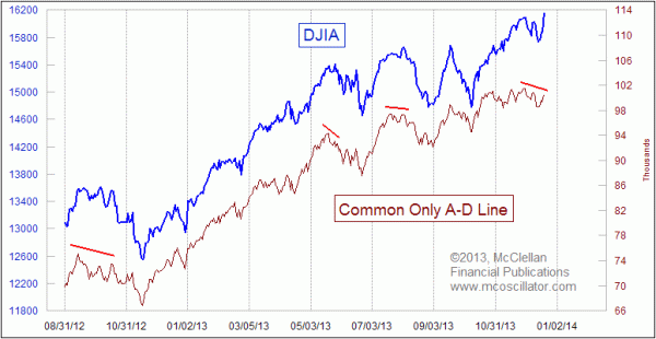
Note: data for the Common Only advances and declines is published each week in the Barron's Market Lab section. We also calculate our own version from scratch, which is the data reflected in this chart.
Everyone should remember that for now, these divergent conditions are still just a warning. For the price indices to make a higher high is generally a bullish action. It is only the last new high that is the bearish one, and along the way a lot of bullish new highs can pile up. Breadth numbers could possibly undergo a sudden improvement, and take away the divergence that is evident now. So we cannot just notice this divergence now and then forget about it. If the market does indeed make a price top in mid-January, as the 1929 analog suggests, and if the divergences are still in effect, then that will convey a more dangerous message about what lies ahead for 2014.
Tom McClellan
Editor, The McClellan Market Report
Sep 10, 2013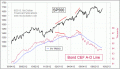
Bond CEFs Still Say Liquidity is in Trouble |
Oct 04, 2013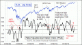
Summation Indices’ Messages |
Jan 21, 2011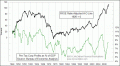
Why Even Fundamental Analysts Should Watch A-D Line |