A Review of Analogs
Free Chart In Focus email
Delivered to you every week
Have you ever lived through an earthquake? I grew up in southern California, and lived through the 1971 San Fernando earthquake that fractured the Van Norman dam, knocked down several buildings, and generally caused turmoil. I got to skip school for 3 days after the quake.
I now live in western Washington, and lived through the 2001 Nisqually earthquake, which knocked down some buildings in Seattle and generally caused great annoyance.
None of these compare to the magnitude of the big Tohoku earthquake in Japan, which spawned a tsunami that destroyed the Fukushima nuclear powerplant, and caused great damage to other areas of Japan.
And according to the Pacific Northwest Seismic Network, I have also lived through 201 earthquakes in just the past 14 days, although I did not even notice any of them. An earthquake does not have to destroy a city to still be an earthquake.
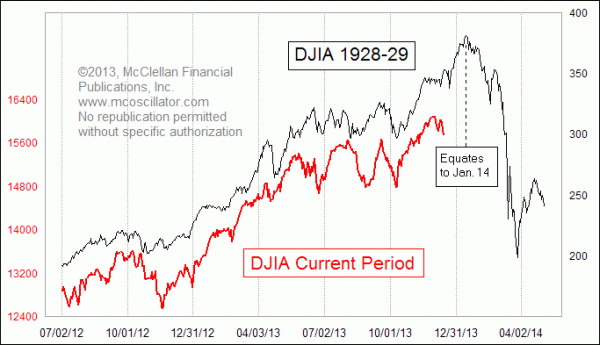
This is an important principle to understand when we contemplate the topic of price pattern analogs in the stock market. I attracted a lot of attention, and a lot of derision, when I wrote about the resemblance of the current market's price pattern to that which occurred back in 1929. This week's chart updates that relationship, and we can see that the relationship has not broken correlation yet. For as long as the correlation continues, it is interesting and potentially useful. But anyone who endeavors to employ such an analytical tool should understand that all such pattern analog relationships break correlation eventually, so they should always be viewed with skepticism alongside the fascination we have for the pattern correlation and its (potential) message about the future.
I made that very point two weeks ago in my Chart In Focus article about the 1929 stock market pattern analog. But some people could not get past the point that I had brought up the 1929 event, and they concluded that I was forecasting a huge crash, another Great Depression, and more. That was not what I said, but the actual words I used and the analysis I offered seem to be secondary for some people, whose agenda is to be dismissive of others. Why let the actual evidence and statements get in the way of a wonderfully inflammatory and critical story?
The criticisms of that 1929 analog tend to fall into 3 general categories:
- The scaling is different, and so the comparison is wrong.
- The fundamentals are different, and so the comparison is wrong.
- Someone can take any 2 periods and put them on a chart to make them look the same.
Addressing point number 1, that the 1929 analogy is supposedly wrong because the scaling on my chart is not equivalent, and therefore the conclusions are necessarily wrong: This stems from a prejudiced view that it is the magnitude which matters, and not the "dance steps" of the pattern. The earthquake analogy should be sufficient to illustrate that identical magnitudes are not always the important factor.
Fred Astaire could dance the Charleston. And a sumo wrestler could dance the Charleston. It would admittedly look different in some ways, and it would definitely feel different from the standpoint of the dance floor. But it would still be recognizable to an observer as the Charleston.
But to those for whom such logic is insufficient, let me offer a case history to illustrate how price magnitude is not really the important factor in governing the way that prices behave, and whether or not an analog is valid. Most modern traders have at least heard of the big crash of 1987, but few remember the little micro-crash of 1994. The total price damage in 1994, top to bottom, was just 9.9%, and yet the pattern itself strongly resembles what happened in 1987. The magnitude of the 1987 event was much greater, both in terms of the volatility before the top and the severity of the actual crash. And yet the "dance steps" look an awful lot like what happened in 1994.
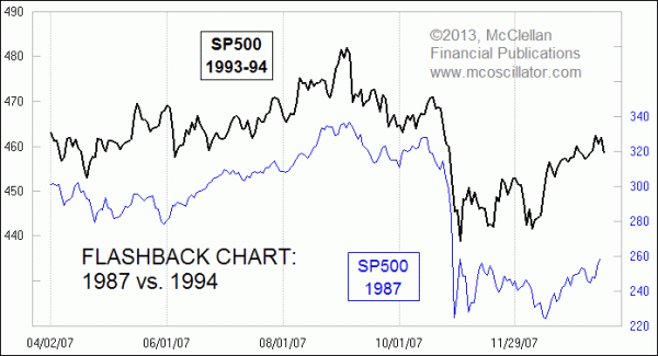
If it was the total magnitude of the price decline which mattered, then we could have never discovered the pattern analog between 1987 and 1994, since the magnitude of the price change in each period was so very different. But it is obvious from looking at the chart that there is indeed a genuine similarity. And so if someone had been insightful enough to match up the pre-crash patterns between what happened in 1987 and what happened 7 years later in 1994, then that analyst could have potentially foreseen ahead of time what unfolded.
The 2nd argument, that the fundamentals are different now and thus the whole comparison is all wet, is something that I acknowledged and addressed in my article two weeks ago. While it is true that the so-called fundamentals are different now, that factor has not stopped the current pattern from looking the same as the 1929 pattern up until now. So why does that factor have to mean that the resemblance must stop working? A lot of analysts think that they know which factors are the ones which matter. But if wholly different economic and fundamental factors can still produce stock price patterns which correlate so closely (up until now), then my question is this: are those really the factors that matter?
And if those factors are not the ones that can explain the current price behavior similarity, then why are they the ones that matter for future price pattern similarity, or lack thereof?
Why do price pattern analogs ever work at all? My answer is that human populations tend to fall into similar and repeating patterns of human emotional response, and this gets reflected in repeating patterns of price action. This is the entire basis for classical bar chart pattern analysis. Even though 2 different triangles might look different in some ways, or 2 different head and shoulders structures, the driving psychology behind the formation of such structures is largely the same, and tends to result in similar outcomes.
The 3rd argument is a peculiar one, asserting that a chartist can take any 2 periods, throw them together on a chart, and make them look similar. This argument could only ever be made by someone who had not actually tried to do this. Anyone with the least bit of experience in playing around with price data would know that this is not the case. But such critics convert their hypotheses into assumptions, and then into "facts", without ever checking whether they are actually true. Prejudiced assumptions are not the same as facts.
Here is a case in point. The 1987 crash was a lot like the 1929 crash in some respects, and different in others.
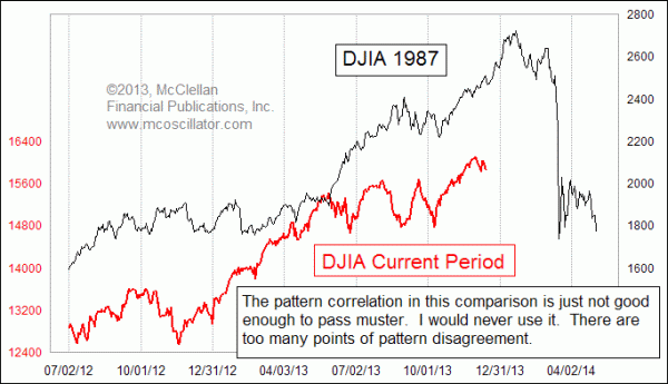
Throwing together the current market pattern with the 1987 crash pattern results in a wholly unsatisfying comparison. Both are in uptrends to this point, that much is true. But there are so many points of pattern dissimilarity that I would never put this forth as representative of what is happening. One can shift the patterns fore and aft, and it does not really get any better.
Perhaps the biggest point about analogs which their critics (and mine) do not understand is that all analogs eventually break up. They don’t work in perpetuity if one extends backward off of the left end of the chart, and similarly at some point within the chart or off of the right end, the pattern correlation eventually breaks up. Price patterns suddenly fall into correlation with a prior pattern, and they dance together for a while, and then they break up. Or at least that has been the case in every single pattern analog I have ever studied. So when we notice a similarity between now and the 1929 stock market pattern, that does not mean we can count forward 12 more years and expect the Japanese navy to bomb Pearl Harbor again at that equivalent point. Life does not work that way.
When I find an analog that works, or seems to, it is great for a while, and then suddenly the nice relationship ends. In my experience, the point of a loss of correlation usually arrives right at the point when I am counting on it most to continue working. The key to not getting hurt by that breakup lies in knowing that a breakup in correlation could arrive at any time, and then to watch for and recognize the signs that it is happening.
Here is a great example, one that I have shown in past Chart In Focus articles in August 2013 and also in May 2013, and also in our McClellan Market Report and Daily Edition. Apple's price pattern over the past 3 years has very closely resembled that of Microsoft around the time of the 2000 Internet bubble top.
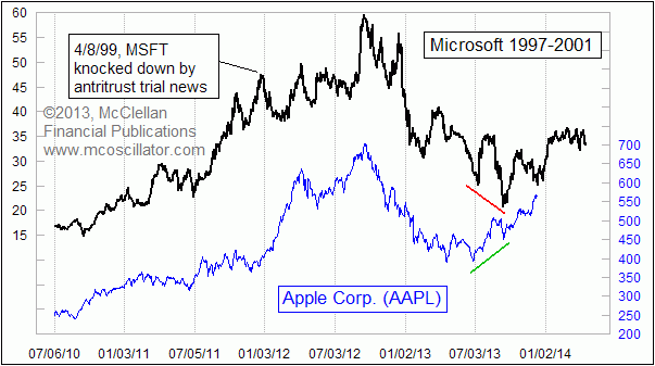
There was one notable misstep in the pattern leading up to the top, which is highlighted. In April 1999, MSFT got knocked down by adverse news from its antitrust case. AAPL's share price did not undergo an equivalent drop at that point, because it did not suffer a similar adverse and exogenous input. Afterward, the two patterns got back into step, and they proceeded nicely in strong correlation, that is up until just recently.
In the summer of 2013, we saw the first sign of pattern correlation breakup when AAPL made a higher low at a time when the MSFT pattern said that a lower low was on the script. They continued to dance somewhat together for a few more months, but now in December 2013 the correlation appears to be pretty thoroughly broken. What was a bottom at this point for MSFT's price pattern is decidedly not a bottom for AAPL's price pattern.
So in summary, analysts and market participants should not expect more from such pattern analogs than they can offer. But neither should we dismiss them as wholly without use. The story does not have to be repeated in exactly the same way, or with the same magnitude. We just have to be able to recognize the same dance steps being traced out to a satisfactory degree, and when we do, then we can see a model of what the future may look like, while also knowing that the correlation might break up at any time.
Tom McClellan
Editor, The McClellan Market Report
Nov 07, 2013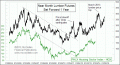
Housing Stocks To Pop Up Into 2014 |
Jun 20, 2013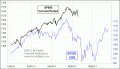
SP500 Following In 1998’s Footsteps |
Sep 22, 2011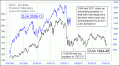
1946 Analog Holds Key For Current Market |