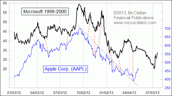
Apple Still Following Microsoft’s Footsteps
Free Chart In Focus email
Delivered to you every week
Several months ago, I introduced the chart comparing the stock price pattern of Apple Corp (AAPL) in the current day to that of RCA in the late 1920s. I later also drew a comparison to Microsoft (MSFT) before and after its top with the Internet bubble in 2000. That latter one merits an update.
Looking at AAPL's price pattern alone, the situation does not look all that bad. It has broken out above the declining tops line which was in effect from the top last year, and then the price went on to drop back down to test the top of that broken downtrend line. And since that test, there has been a pretty nice rally along with the rest of the stock market. Maybe AAPL is finally getting back into sync with the seemingly endless bull market.
Or maybe AAPL is just continuing to match the pattern laid down by MSFT 13 years ago. The chart shows a failing pop up in MSFT at this equivalent point in the pattern analog, which was followed by another drop to even lower lows. The two pops do not match each other perfectly, and indeed most of the chart shows imperfections in the way that AAPL is dancing out the same dance steps. There is some of an effect I call "accordioning" of the bottoms and tops, some coming a bit earlier or later than MSFT's pattern said should have been the case. So slight differences in timing are just a normal part of this relationship.
We would know that AAPL is finally doing what all price pattern analogs do, eventually breaking the correlation to the prior pattern, if we see AAPL's share price make a more drastic deviation from the MSFT's prior pattern. We have not seen that yet, and so the analog's continuation still gets the benefit of the doubt.
None of this is to say that Apple the company is the same now as Microsoft the company during the Internet bubble. They are quite different. But what is the same is the way that the investing public falls into and out of love with the tech darling du jour. That investor behavior is what explains the chart pattern similarity, and that behavior is what technical analysts strive to take advantage of.
Tom McClellan
Editor, The McClellan Market Report
Jan 24, 2013
After The Fall, Revisiting Apple and RCA |
Sep 22, 2011
1946 Analog Holds Key For Current Market |
Aug 06, 2010
Correlations May Not Be What They Seem |