“Open” Arms Index Shows Overbought Condition

Free Chart In Focus email
Delivered to you every week
Years ago, an analyst named Richard Arms wondered what it meant when the stocks going up (or down) traded a greater share of the total volume than the other side. So he created a ratio which now bears his name, the Arms Index, which looks at the A/D ratio versus the Up/Down Volume ratio. The raw formula is as follows:
Advancing Issues / Declining Issues
-----------------------------------------
Up Volume / Down Volume
It is neutral at 1.0, and readings below about 0.5 or above 2.0 show an overbought or oversold condition, respectively.
I just spent the past weekend with Dick Arms at a conference of professional technical analysts. He is very much alive and continuing to ply his craft as a technical analyst, even inventing new techniques that he spoke about to the group, including his work with Equivolume Charts. He is a friendly and gracious man in person. At my urging he also told the assembled group the story of how the Arms Index came about, including its name. You can read more about Dick's work at http://www.armsinsider.com/.
Dick first wrote about this indicator back in the 1960s, and had an article on it published in Barron's at the time. It was picked up by many analysts as an interesting indicator, and listed as an index on quote systems like Reuters, Quotron, and Telerate. Back then it was just referred to as a TRading INdex, and thus it was listed under the symbol "TRIN" which is still used on many quote systems to this day.
Before CNBC, there was a cable news TV network known as FNN which was based in Los Angeles. John Bollinger was the Chief Market Analyst there, and he thought it was just wrong that Dick Arms' own indicator did not get listed bearing his name. So Bollinger lobbied to have it listed instead on the FNN ticker as the "Arms Index" and the FNN management agreed. Among well-educated technicians, it is known to this day as the Arms Index.
Many years ago, Peter Eliades of www.stockmarketcycles.com originated an innovation to the Arms Index calculation. The daily values of the Arms Index are somewhat noisy, and so some smoothing can be helpful. Such smoothing is often done as a simple or exponential moving average of daily closing Arms Index values. But Peter had a different idea for how to smooth it, which he titled the "10-Day Open Arms" Index. The formula looks at each of the 4 breadth items in the original formula separately, summing them over the past 10 trading days, and then re-using the original formula. It looks like this:
Last 10 day's Advances/Last 10 day's Declines
------------------------------------------------------------------------
Last 10 day's Advancing Volume/Last 10 day's Declining Volume
It is still a 10-day smoothing, similar to a 10-day moving average, but any overweighting of a single day's value is combined with the other days in a slightly different way. Each component's inputs from the past 10 days are summed together before being compared to the other components' 10-day totals. It was an interesting twist on how to smooth a noisy indicator.
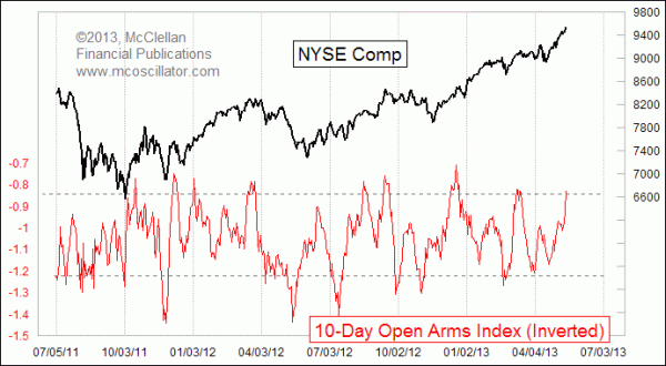
And right now, that interesting twist is showing a pretty big overbought condition. The chart above shows that the 10-day Open Arms Index is at a fairly high level on this inverted scaling, and such readings are reliably associated with meaningful tops for stock prices. I have inverted the scaling for the 10-day Open Arms Index in this chart, to better compare extreme readings with the tops and bottoms for stock prices.
When a high chart reading like the current one (i.e. a low raw reading) appears after a meaningful decline, it can sometimes be a signal of strong upward initiation for a new uptrend. But when it appears late in an uptrend as it is doing now, it is more often a sign of conclusion for the advance.
Taking this investigation a bit further, I had wondered a few years ago if looking at the Arms Index or the 10-day Open Arms Index on just "common stocks" would make for a better indicator than the composite version which looks at all issues. A lot of technicians take the view that issues which are not real operating companies end up contaminating the data, and so they should be discarded. I was already calculating the A-D and UV-DV data for common only issues myself, and so it was a matter of just adding a couple more columns to the spreadsheet.
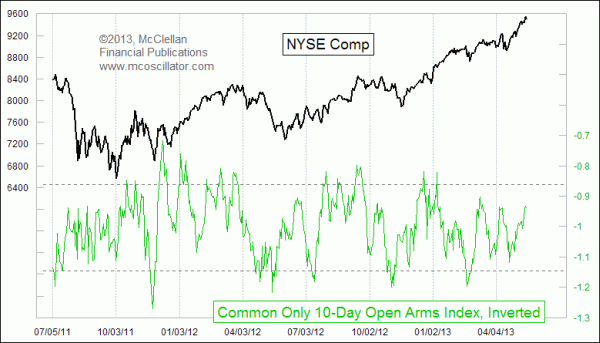
But rather than making for a better indicator, the results were somewhat disappointing. Here is the Open 10-day Arms Index for just common stocks, once again inverted for better correlation to price action:

It shows that sometimes there are good high and low readings which correspond to price tops and bottoms, but at other times it seems really awful. Its performance as an indicator is just not good enough to make me want to watch it and believe in its message.
So what are we to conclude from this? Dick Arms hit upon a great indicator when looking at all of the issues traded on the NYSE, and Peter Eliades made a nice addition to that work with his innovation. Arms' intention was to look at the difference between what the advancing and declining stocks were doing in terms of how much volume each traded. But it seems to me that this is not where the magic of his indicator lies. Rather, the magic is the story that the Arms Index tells about the difference in behavior, either advancing or declining, among the stocks which trade most of the volume versus the other issues which don't trade much volume.
The "common only" issues make up just 59% of the total NYSE issues by my count, and yet that group regularly trades more than 90% of the share volume. Taking away the preferred stocks, bond funds, rights, warrants, and other issues that make up the other 41% of issues does not actually make for a better version of the Arms Index. Instead, it degrades the useful message which comes in the composite version.
Tom McClellan
Editor, The McClellan Market Report
Jan 11, 2013
The Disappearing Volume |
Dec 06, 2012
The Market is Almost Never “Normal” |
Nov 15, 2012
Summation Index’s Magic Tricks |