Summation Index’s Magic Tricks
Free Chart In Focus email
Delivered to you every week
When chartists talk about "magic" properties of indicators, it is with some degree of reverence for the mysterious ability to show us amazing insights that defy the presumption of randomness. They touch upon the romantic nature of staring at lines and dots on a white background (for those who grew up like I did charting on graph paper) and finding those pearls of information.
The Summation Index that my parents developed 43 years ago carries at least a couple of magical properties. I was assuredly no help in its development, since at age 8, I was more interested in Hot Wheels cars than breadth statistics, and I had not mastered the algebra skills needed for the manual calculation of exponential moving average values. This was 1969, when hand-held calculators were still a long way off, let alone personal computers, and so manual calculations and plotting on graph paper was how one did it, if it was going to get done.
The McClellan Oscillator first came about when my parents wanted to dig deeper into the indicators used by the late P.N. (Pete) Haurlan, who was an actual rocket scientist and who published the Trade Levels Report newsletter. He was the guy who introduced the use of what we now call exponential moving averages to the tracking of stock prices. It was a piece of math borrowed from his other field of rocketry and satellite tracking. Read more about that interesting story here.
Pete Haurlan liked to track individual exponential moving averages of the daily breadth numbers (advances minus declines). But he did not identify which EMAs he used to calculate his various "Haurlan Index" values. When Sherman and Marian McClellan started looking at breadth data on their own, they could not find a single EMA that worked really well. Their key insight was to look at the difference between the 10% Trend (19-day EMA) and 5% Trend (39-day EMA), and that numerical difference between the EMAs came to be known as the McClellan Oscillator. Coincidentally, on the other side of the country, and without communication between them, an analyst named Gerald Appel started playing around with the difference between two moving averages in 1969, and his work in that area came to be known as Moving Average Convergence and Divergence (MACD).
My mother Marian (who passed away in 2003) had been a math major in college, and so she had done integral calculus at a time when it was not commonly taught like it is today. When she looked at the plot of the McClellan Oscillator, she naturally wondered what it would mean to integrate the "area under the curve", like students do regularly in calculus. That's how the Summation Index was born, as an indicator which changes each day by the value of the Oscillator.
One of the problems that my parents encountered when trying to teach people to use the indicators was if you had a negative McClellan Oscillator value and you had to add it to a negative Summation Index value, then people got confused about what to do with all of the + and - signs. That led to some calculation errors. At that time, they noticed that the Summation Index had a total amplitude of about 2000 points, which was smaller than its amplitude today because of the smaller number of issues traded then. So they just arbitrarily moved all of the Summation Index values upward by 1000 points so that having to deal with the manual calculation problems brought by negative values would be a rare event, and thus an unusual one. In the 1960s and 1970s, the Summation Index almost never got below 0 except in really extreme conditions.
We have maintained that +1000 neutral level convention to this day for the "classic" version of the Summation Index, so as not to cause confusion. For the more modern version that we call the Ratio Adjusted Summation Index (RASI), we use the more natural zero level as the neutral level. The RASI factors out changes in the number of issues traded, making it better for longer term comparisons and analysis.
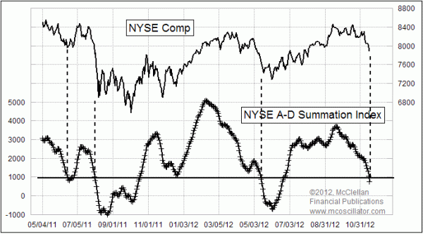
The idea of a neutral level is an important one, as this week's chart illustrates (yes, I'm finally getting to this week's chart). When the Summation Index crosses through its +1000 neutral level, it usually reveals one of the magic tricks that it possesses. Crossing down through neutral usually marks a bottom of some type. It may not necessarily be THE bottom, but it is usually a least a bottom of some significance.
At the left end of the chart above are two examples of this principle. The first dip below +1000 marked a preliminary bottom that was followed by a failing bounce. The next dip below +1000 was a couple of days early for marking the August 2011 price bottom, but the effect was still there.
When the Summation Index crossed down through +1000 back in May 2012, the price bottom marked by that event was a bit early for the final bottom, but it was a bottom nonetheless. The effect of passing through +1000 is not permanent, but it is there.
Now we are seeing another downward crossing through the +1000 neutral level, just as the market seems to be reaching the conclusion that taxes are going higher, and earnings are going to fall, and money will dry up, and the sky is falling, and we're all going to die!!! But my suspicion is that the Summation Index is going to do another bit of magic, and mark at least a temporary bottom with this crossing down through +1000.
One of the agenda items that is as yet unfulfilled for this bull market is to see a Summation Index failure which would indicate the end of the up move. We typically quantify that using the new-fangled version of the Summation Index, the RASI that I mentioned above. Important tops for stock prices usually seem to have a relationship to a failure at or below the +500 level on the RASI.
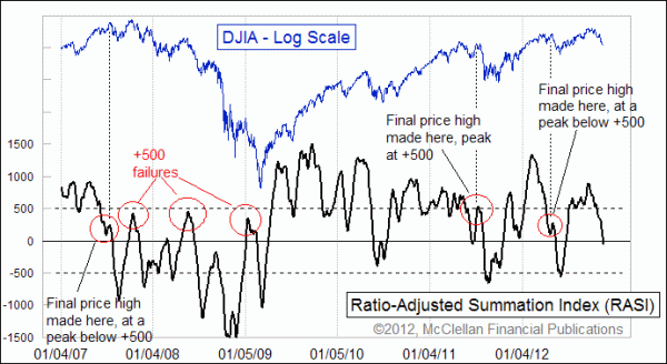
To end an uptrend of significance, there is usually a failure of the RASI to climb up above +500, a level which currently equates to around +2500 on the classic version of the Summation Index. When the RASI dips down to a nice oversold level and then is able to climb up above +500, it promises us higher price highs. It is a message of adequate liquidity to continue, even as a shorter term overbought condition might necessitate a brief pause to refresh.
It is at the moment when the RASI cannot climb back up +500 that its other big magic trick becomes evident. A few good examples are highlighted in the second chart. Thus far, we have not seen such a failure yet. It is really not typical for the stock market to see an important top at a really high Summation Index level, like the raw value high of +3689 seen back on Sep. 21, 2012 (RASI equivalent: +888). A much more normal resolution is to see a dip down toward neutral like what we have just seen, and then a failing attempt for the RASI to climb back up above +500. If we see that unfold in the next few weeks, with a failure by the RASI to climb back up above +500, then we'll know that the typical weakness of the first year of a new presidential term is playing out according to the normal script.
Tom McClellan
Editor, The McClellan Market Report
Jan 13, 2012
RASI Above +500 Says Bull Market Not Done |
Oct 01, 2010
RASI or Classic - Which Summation Is Better? |
Apr 20, 2012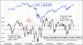
Summation Index Promises Higher Highs After Correction Ends |
Oct 14, 2011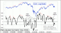
The Key To Watch For In November |