Summation Index Promises Higher Highs After Correction Ends

Free Chart In Focus email
Delivered to you every week
The Summation Index can give us important information about what lies ahead for the stock market, as long as one knows how to interpret it correctly. For longer term comparisons like this, I like to use the Ratio Adjusted Summation Index (RASI) instead of the classic version, because the RASI factors out changes in the total number of issues traded on the NYSE.
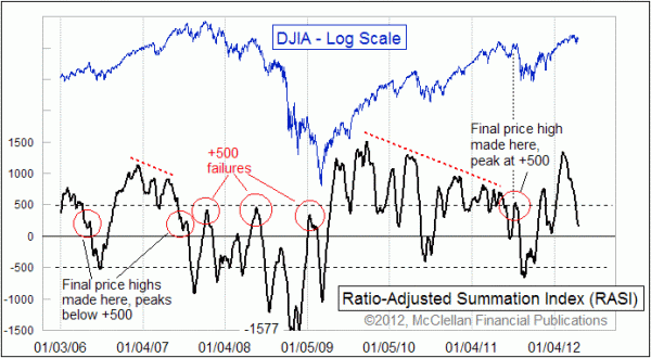
Back in January 2012, I wrote about the important bullish message that the Summation Index was giving us. The RASI had just climbed up above the +500 level then, confirming that the up move was part of a strong new uptrend, and not just a failing rally. If the RASI had failed to reach the +500 level, that would have been a sign of trouble.
Instead of stopping at or below +500, the RASI was able to climb all the way up to a peak at +1343 back on Feb. 9, 2012. That super-high level says that there is a whole bunch of liquidity available to lift the market. Strong liquidity is a condition that tends to persist for a long time, even as the market goes through the necessary corrective process that will set up for the next stage of the uptrend.
We are in that corrective period now, and the RASI has done a nice job of decaying back down toward a neutral state. Getting back down toward or through the zero level helps to un-stretch the rubber band, and set up for the next up leg.
Big uptrends almost never end on super-high Summation Index readings. A few examples can be found in history, but they are very rare, and they usually involved the Fed or some other governmental action putting a thumb on the scale to kill the uptrend.
Instead, the more typical action following a super-high Summation Index reading which initiates a new uptrend is that we see a fairly long series of lower Summation Index highs, each above +500, before we finally get to the final price top. Seeing the major averages make a higher high with the RASI below +500 is a big fat warning of real trouble, and some examples are shown in the chart.
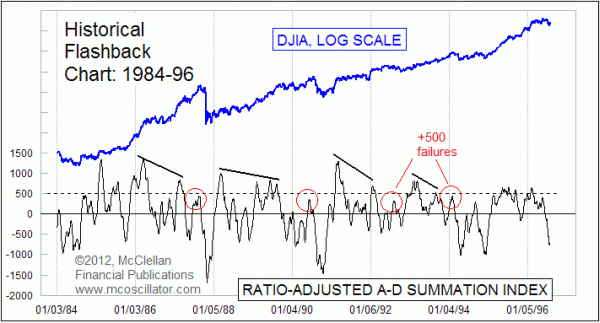
This RASI behavior of signaling important things at the +500 level is not a new phenomenon. Here is a chart showing the RASI's behavior from 1984 to 1996.

The key points to notice are first that the really high RASI readings of +1000 or higher tend to occur early in new uptrends. Over time we see a progression of lower highs that are still above +500, as stock prices continue to higher highs. The red circles highlight failures to get the RASI up above +500, and those mark important tops for the stock market that are followed by either a lengthy corrective period or an outright bear market.
So the point to take from this now is that because the RASI is just now coming off of one of those really high readings above +1000, we still have a long way to go for the bull market. We should expect to see a progression of lower RASI highs over the months or years ahead, and we should only worry about having a really ugly bear market at the point when we have seen that progression of lower RASI lows and we finally get to one that fails to get up above +500. With the eurodollar COT leading indication calling for a powerful rally starting in June, I do not expect to see one of those +500 failures for a long time.
Tom McClellan
Editor, The McClellan Market Report
Jan 13, 2012
RASI Above +500 Says Bull Market Not Done |
Feb 03, 2012
Eurodollar COT Indication Calls For Big Stock Market Top Now |
Oct 21, 2011
McClellan Oscillator Confirms New Uptrend |