Fed and ECB Balance Sheets

Free Chart In Focus email
Delivered to you every week
When it comes to the overall stock market, there are only 2 fundamental factors which matter. Forget dividend yield, earnings growth, book value, etc. The only two factors which matter for the overall market are (1) How much money is there? and (2) How much does that money want to be invested?
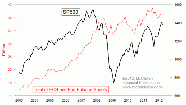
This week's chart looks at a big contributor to factor #1. It compares the SP500 to the size of the combined balance sheets of the European Central Bank (ECB) and the US Federal Reserve. The ECB data are reported in euros, and so to combine that with the Fed's data I converted it all into dollars.
We can see that during the whole bull run from the 2003 low to the high in 2007, the two central banks were fueling both the stock market liquidity and the real estate bubble with growth in their balance sheets. That's another way of saying that they were printing more money to liquefy the system.
Then in 2008, just as the stock market was starting to stumble, the balance sheet growth came to a screeching halt, pulling away liquidity just as the markets needed it most, and exacerbating the severity of the decline. Only when their combined balance sheet size started to go up again in 2009 did the stock market begin to recover.
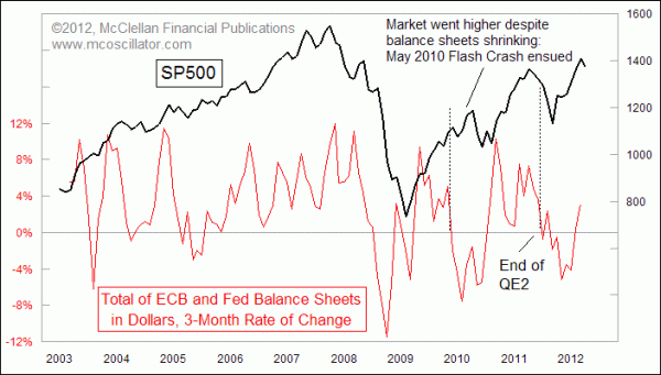
We can see this relationship even more clearly when we look at a 3-month rate of change:

The data on both the SP500 and the balance sheet growth in this chart are monthly closing values, and we can see that surges and retreats in the balance sheet growth rate have coincided with rallies and pullbacks in stock prices. Or at least that's true for the most part.
Something interesting happened in 2010, when balance sheet growth went negative, but the SP500 managed to continue going higher for a while. Eventually the stock market came to the realization that there was a liquidity problem, because in May 2010 there was a rapid adjustment in stock prices which came to be known as the Flash Crash. The SP500 started going up again after a bottom in July 2010, once the Fed and ECB combined balance sheet size started having positive growth again.
Unfortunately, we cannot use this very well as a predictive tool. The Fed reports changes to its balance sheet every week, and their balance sheet has been shrinking since a peak during the week of Feb. 15, 2012. But the ECB reports its data monthly, and with about a 1 month lag. So while reviewing this data can help us to understand why things have happened, it is not much good at telling us what is going to happen.
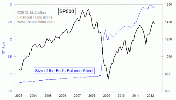
For those who are curious, here is what just the US Federal Reserve's balance sheet growth looks like. The falloff in the Fed's balance sheet growth since the Feb. 15 top appears to finally be starting to matter for US stock prices.

Someday, we may return to an environment in which the big central banks stop interfering with the normal functioning of the financial markets. But that is not the environment we live in now.
Tom McClellan
Editor, The McClellan Market Report
Mar 23, 2012
SP500 Undervalued Versus M2 |
Mar 16, 2012
In Order To Tame Inflation, Just Tame Uncle Sam |
Feb 03, 2012
Eurodollar COT Indication Calls For Big Stock Market Top Now |