Ten Hindenburgs So Far
Free Chart In Focus email
Delivered to you every week
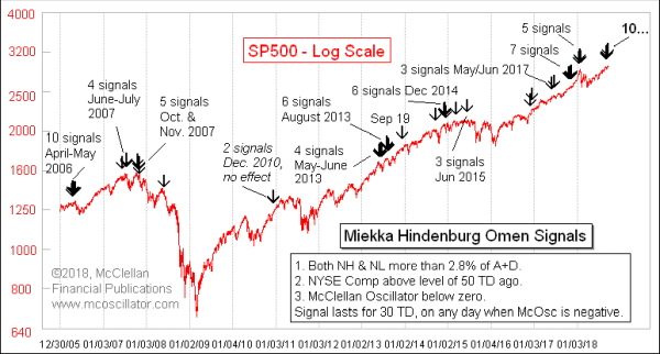
The stock market has been doing something peculiar lately. In an obvious uptrend, we are starting to see an increasing number of NYSE-listed issues making new 52-week lows. When the number of New Highs (NH) and New Lows (NL) both exceed a certain threshold on the same day, coupled with some other criteria, that is known as a Hindenburg Omen. And what we are seeing lately is a very large cluster of them in a short time span, a behavior that tends to have more importance than a lone signal all by itself.
This signal was created by the late Jim Miekka, who was a mathematician and market analyst. He wanted to improve on Gerald Appel’s “Split Market Sell Signal”, which occurred whenever both NH and NL exceeded 45 on the same day. The adjustments which Miekka made accounted for the growth in the number of issues traded since the days when Appel first introduced that signal, and Miekka also added some other filtering criteria.
I should add that some analysts use different criteria from what Miekka specified, and so you may find differing accounts about the number of Hindenburg Omen (HO) signals we have had lately. I use the criteria which Miekka himself told to Greg Morris for his book, The Complete Guide to Market Breadth Indicators, which are shown in the inset box in the chart above.
The fun part of the story about how the Hindenburg Omen came about regards the way its name was chosen. When Miekka developed it in 1995, he discussed it with the late Kennedy Gammage, who for many years wrote The Richland Report newsletter, and who helped to make the McClellan Oscillator famous both in his newsletter and in his frequent appearances on FNN (which became CNBC). Kennedy had a background in advertising, and so he knew the value of a good brand. He also knew about Bill Ohama’s “Titanic Syndrome”, which also looks at the data on NH and NL. So Ken suggested the name “Hindenburg Omen”, and Miekka adopted it.
One of the claims about the Hindenburg Omen that I have seen several analysts make lately is that it predicted the crash of 1987. This is an interesting claim, since Miekka did not put together the rules for the HO until 1995. It is true in one sense, that if one had used those rules in 1987 (before they were crafted), then one would have seen it fire off a cluster of 3 signals on Sep. 23-25, 1987.
Not every signal leads to huge calamity for stock prices. But these signals do tend to show up before big bear markets. So an HO signal is a warning of trouble, but not a guarantee of it. And as noted in the rules, an HO signal is invalidated once the McClellan Oscillator goes back up above zero.
Clusters of signals appearing in a short time span seem to be more important than individual signals, as if the market is pounding the table and saying, “Listen to me!!” We have such a cluster now, with 10 signals appearing in the month of September. That ties the largest such cluster ever.
Jesse Felder of The Felder Report came up with an interesting way to look at this in a November 2017 posting on his web site. He chose a six-month lookback period to count how many HOs there had been, and it makes for a pretty compelling indicator:
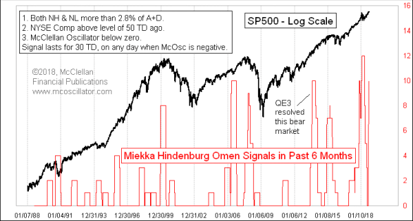
As with the point about single signals, not every cluster always works out to be important. A big cluster of them back in 2013 seems to have been overwhelmed by the tsunami of fresh money coming into the banking system, courtesy of QE3. But big spikes in 2000, 2007, and 2015 did seem to matter a lot. And so did the biggest spike of them all which hit 12 on Feb. 1, 2018, just ahead of this year’s minicrash.
Now we are seeing this count rising up again to a very high level, which is a concern. Perhaps it is a big sign of trouble, or perhaps the transition to the period of positive seasonality in October will act as a stronger force to keep the uptrend going. The warning of trouble gets extra emphasis from the fact that we have a small divergence now between the major averages making a higher high in September while the NYSE Advance-Decline Line has made a divergent lower high. That divergence can be rehabilitated if the breadth data suddenly start getting stronger, but for now the dual message of trouble is worthy of our concern.
Tom McClellan
Editor, The McClellan Market Report
Dec 11, 2014
What Hindenburg Omens and an Oil Crash Mean |
Jun 06, 2013
Hindenburg and Titanic, OH MY! |
Sep 13, 2018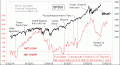
What Happened to the Eurodollar COT Model? |