The Supposed Superiority of Common Only A-D Data

Free Chart In Focus email
Delivered to you every week
I get asked a lot about the supposed problems with the NYSE’s Advance-Decline data, which some analysts claim is “contaminated” by the inclusion of NYSE-listed issues that are not “real stocks”. If one is going to look for meaning about the stock market, some analysts say that one should really only look at the Advance-Decline data for the real stocks, or so goes the thinking. As with a lot of widely held beliefs, this is one that struggles when confronted with the actual data.
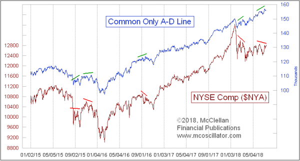
The reason one hires the A-D Line is to do a certain job. Most of the time, we know that the A-D Line is going to do pretty much what prices do. It is at the unusual moments that you want the A-D Line to tell you that something is different. You want a canary in the coal mine, to tell you that there are bad gases ahead of when the big burly coal miners keel over. And the Common Only A-D Line is just not as good at doing that job. This week’s chart offers some great examples to illustrate.
In each of these highlighted instances, the Common Only A-D Line was showing a higher high while the NYSE Composite Index was making a lower high. If one had believed the Common Only A-D Line about its message of strength greater than what was shown by prices, one would have been misled. That is a problem.
But in failing so proficiently, the Common Only A-D Line can actually be useful. This A-D Line moved to a higher high made on July 9, 2018, but the NYA has not confirmed. So for the moment anyway, we have another one of these divergences where the Common Only A-D Line is saying things are wonderful, while the NYSE Comp is disagreeing.
The main criticism about the A-D data is that a lot of things are in there which are not “real stocks”, and these are viewed as contaminants. Chief among the category of issues getting blame for that contamination is the Bond Closed End Funds (CEFs). They are not considered to be “real stocks”, and are thought to be overly influenced by interest rate movements. But they can give useful insights about the status of financial market liquidity, and they tend to give that message ahead of that problem being evident in stock price data.
Here is a rundown of the numbers and percentages of NYSE-listed issues, as of Monday, July 16, 2018:

Most of those categories are self-explanatory. The “Specialty” category is our catch-all dump for all of the weird things. So items like rights, warrants, structured products, “when issued”, and anything else that does not fit into the other categories.
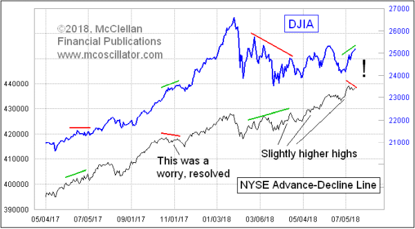
When we look at the composite A-D Line, made up of all issues listed on the NYSE, we see that it gives a slightly more reliable message than the Common Only version. And right now it is saying that there is a small problem. It is not confirming the higher highs in the DJIA, and disagreeing with the higher high in the Common Only A-D Line shown above.

This is not a monstrously huge divergence like what we saw at the 2000 and 2007 major stock market tops, divergences which led to major market declines. Instead, this is a small divergence, and so its meaning should be about a relatively small decline.
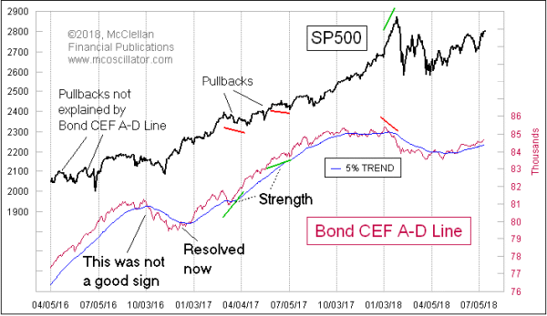
Turning back to the supposed major contaminant of the A-D data, what I have found is that the Bond CEF data are actually a much better canary in the coal mine than the common only numbers. Here is a Bond CEF A-D Line:

Notice that at the January 26, 2018 price top, the Bond CEF A-D Line was showing us a useful bearish divergence. It was saying that liquidity was starting to dry up then, and it said so ahead of the minicrash in early February. And it was giving bullish divergences in 2016 and 2017 when it was appropriate to do so. The Bond CEF A-D Line did say there was trouble right after the Nov. 2016 elections, but then it got over that.
So rather than being a contaminant, the Bond CEF A-D data are arguably improving the composite A-D numbers by their inclusion.
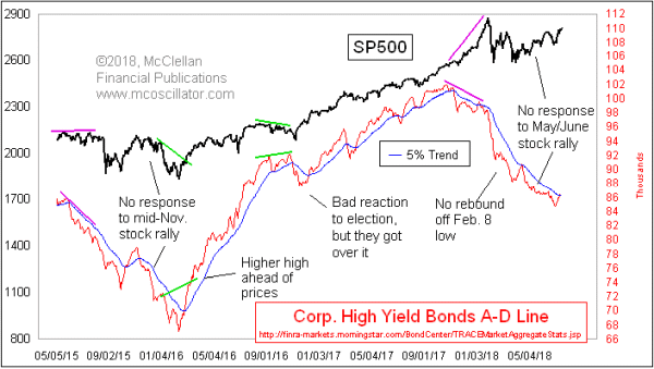
The real king of the coal mine canaries is something else altogether, an A-D Line of junk bonds, as those bonds are categorized and tabulated by FINRA:

Note the big early warning it was giving in late 2017 and Jan. 2018. It just had a brief poke up above its 5% Trend (AKA 39EMA), but appears to be turning back down again, saying that there is not liquidity to support what stock prices are doing.
I should add that I had previously set about the whole effort to compute my own Common Only A-D data years ago, after the WSJ and NYSE stopped publishing theirs, because I believed it would be superior to the contaminated composite data. It is quite an effort, tabulating what are all of the listed stocks, and what are their price changes each day. I have had help from a couple of great programmers and dataphiles. And it was only through many hours of looking at the actual data that I eventually realized that it is the “uncommon” issues that are the real gems, and that they are not just chaff to be discarded.
In a proper and orderly universe, real stocks would give the better indications about what the real stock market should do. That is what would make the most sense. But that statement is not a fact, it is an hypothesis, a belief, and one which does not survive contact with the actual data. It appears we do not live in a proper and orderly universe, and thus we must turn our attention to the indicators that can do a more reliable job, if we are going to be honest about what the data really say.
My point in summary is that the Common Only Advance-Decline data are not totally without value. But they are not “better” than the composite data as some people assert.
As an epilogue, I should share a bit of history about how the A-D Line first came to be widely followed. The first analysts to contemplate the meaning of the A-D data were Leonard Ayres and James Hughes, of the Cleveland Trust Company, who in 1926 decided to undertake a study of what it might mean when the A-D data do something different than what prices do. Their early work was kept in obscurity for many years, and it was only in 1962 that the larger analytical world became aware of the utility of examining Advance-Decline data.
It was in 1962 that Richard Russell of The Dow Theory Letters, and Joe Granville of The Granville Market Letter, each separately pointed out how the NYSE’s A-D Line had shown a bearish divergence by topping in 1961, whereas the DJIA topped in early 1962. That divergence gave warning of the 27% decline in the DJIA in 1962. People got excited about an indicator which could give an early warning of a bear market like that, and so interest in the A-D Line grew during the 1960s.
I spoke with Richard Russell about this a few years ago, before his death in 2015, and he acknowledged that shortly after both he and Granville brought the A-D Line into the public consciousness, critics claimed it was invalid because of its supposed contamination by the behavior of utilities and insurance stocks, which were supposedly influenced by interest rates rather than the “real” stock market. So this same dismissive argument has been around for years, but it has not diminished the usefulness of examining the A-D Line, when one does the analysis properly.
Tom McClellan
Editor, The McClellan Market Report
Mar 24, 2017
Why Don’t We Use Just Common-Only A-D Numbers? |
Jan 28, 2011
Common Only McClellan Oscillator |
Jan 11, 2018
The Chart That Worries Me: HY Bond A-D Line |