The Chart That Worries Me: HY Bond A-D Line
Free Chart In Focus email
Delivered to you every week
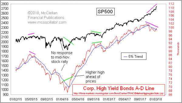
There is no divergence yet between stock indices and the NYSE’s composite A-D Line. But there is one in the High Yield Bonds A-D Line, and that is an early warning of big trouble to come.
High yield bonds usually trade more like stocks than like T-Bonds, and so that has led a lot of analysts to keep an eye on junk bond ETFs like HYG and JNK, especially if they show a divergence relative to stock price indices. Those ETFs tend to be dominated by high yield bonds that are related to oil exploration, and so the price of crude oil can move them around a bit.
The High Yield Bond A-D Line is more egalitarian, looking at the behavior of all of the high yield corporate bonds as tracked by FINRA. Each one gets an equal vote, which is why looking at A-D Lines can be useful in giving a different message than cap-weighted price indicators. And the High Yield Bonds A-D Line in particular can give us interesting indications early on that liquidity is starting to dry up.
High yield bonds are very risky, and thus they tend to be more sensitive to changes in financial market liquidity. We saw an example of this in 2015, when this A-D Line peaked in April 2015, well ahead of the ugliness for the SP500 which arrived later that year and in early 2016. Liquidity seemed to have been restored just after that February 2016 price bottom, and the High Yield Bonds A-D Line shot higher to demonstrate that refreshed liquidity condition.
2007 gives us another example of this principle:
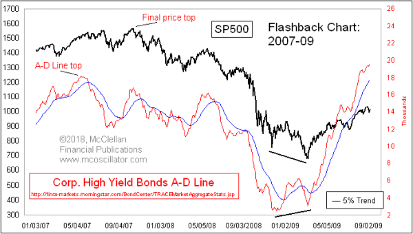
The SP500 had its final price top in October 2007, and we had warning of that from the NYSE A-D Line which had peaked in June 2007. But the High Yield Bonds A-D Line peaked all the way back in May 2007, giving even earlier warning that liquidity was starting to be a problem.
Just because we have a divergence warning now does not mean that the stock market has to start downward right away. It can take a few months before stock traders start to realize that liquidity is getting tight. And it is also possible that a sudden gush of liquidity could lift the high yield bond market, taking away this apparent divergence. I do not think that is going to happen, but it is possible.
This warning from the High Yield Bonds A-D Line fits well with my expectation of a significant stock market top due in March 2018. That expectation comes from my eurodollar COT leading indication, which I discussed in a Chart In Focus article back in April 2016. We feature that regularly in our twice monthly McClellan Market Report and our Daily Edition.
We have to wait and see whether the NYSE A-D Line confirms the liquidity concern with its own divergence.
Tom McClellan
Editor, The McClellan Market Report
Apr 27, 2017
High-Yield Bond A-D Line |
Apr 07, 2016
Eurodollar COT Throws a Curveball |
Oct 27, 2017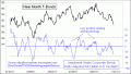
Bond McClellan Oscillator Almost Oversold |