High-Yield Bond A-D Line

Free Chart In Focus email
Delivered to you every week
Junk bonds are the canaries in the stock market’s coal mine.
If you want to know ahead of time that trouble is coming for the stock market, then one of the best places to look is the high-yield (or junk) bond market. The movements of prices among these bonds correlates much more closely to the stock market than to T-Bonds. More importantly, when liquidity gets tight, the junk bonds are the first to be sold by traders wanting to lessen their portfolio risk.
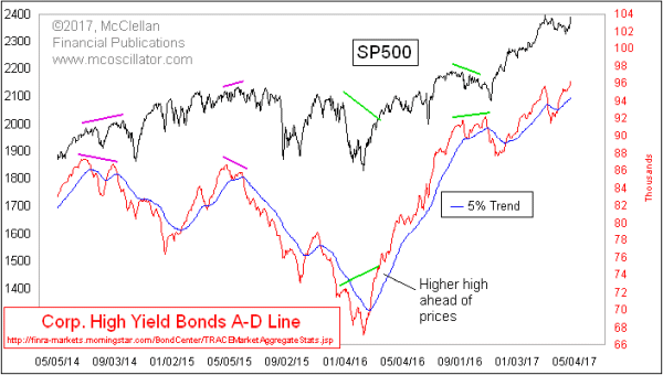
We can see the importance of this message in this week’s chart, which features A-D data from FINRA TRACE. For those who like the full spelling of acronyms, that means “Financial INdustry Regulatory Authority Trade Reporting and Compliance Engine”. FINRA tracks the price changes on a total of 7876 individual bonds, and breaks down the Advance-Decline statistics into categories of Investment Grade, High Yield, and Convertible bonds. The chart above features the A-D data for the High Yield bonds.
This A-D Line arguably does a better job than the composite NYSE A-D Line at doing what we want an A-D Line to do, which is to show us divergences at important times. That is the whole reason behind ever looking at breadth data of any type. We want it to give us an answer which is different from what prices are saying, but only at the right moments.
A lot of analysts mistakenly assert that if one is interested in the stock market, then one should only look at A-D data from the stock market. And to take that point further, they assert that one should filter out all of the contaminants such as preferred stocks, rights, warrants, bond closed end funds, and other detritus which together are making the stock market less pure. I debunked that point in a March 24, 2017 article.
Just recently, the overall NYSE A-D Line moved to a new all-time high, saying that liquidity is plentiful and it should lift the overall stock market. The same message comes from this High Yield Bond A-D Line, which has also pushed ahead to a new all-time high. The message is that liquidity is so plentiful that even junk bonds can go higher. And history shows that such plentiful liquidity is also beneficial for the overall stock market.
Tom McClellan
Editor, The McClellan Market Report
Sep 14, 2016
McClellan Oscillator for High Yield Bond A-D Data |
Mar 24, 2017
Why Don’t We Use Just Common-Only A-D Numbers? |
Dec 01, 2016
McClellan Oscillator for Corporate Bonds |