Copper Shows Bearish Message For Stocks
Free Chart In Focus email
Delivered to you every week
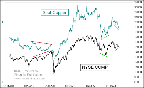
Most of the time, the spot price of copper is very well correlated with what stock prices do. Occasionally there is a momentary squeeze in the copper market, resulting in a spike top that is not reflected in stock prices, and that is quite ordinary. We saw several such spike tops in 2021, and once more in early 2022.
A better indication comes from outside of those brief squeeze events, when we see a more persistent divergence between the two plots. We are seeing such a divergence right now, with the NYSE Composite Index ($NYA) still at a higher low, but with copper prices pushing downward in a lower-highs, lower-lows pattern that defines a downtrend.
Most of the time, when these two plots disagree, copper usually ends up being right about the direction in which both end up heading. That is an alarming insight right now, and it fits with the poor breadth numbers we are seeing. The NYSE's A-D Line shown below is also making lower lows, in conflict with the higher highs in the SP500 and NDX thanks to the upward pull by Apple and Microsoft.
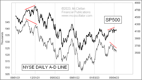
The message of both copper and the A-D Line is that liquidity is tight, and you can thank the Federal Reserve for achieving the goal it has set out to accomplish. They think that they can suppress price inflation by removing liquidity from the banking system via higher short term rates and "quantitative tightening", or QT, meaning selling off their bond holdings. Whether that will actually suppress inflation is a separate question, but there is no doubt that it is hurting financial market liquidity.
Tom McClellan
Editor, The McClellan Market Report
May 11, 2023
NYSE A-D Line Adds to the List of Divergences |
Jul 15, 2022
Wild Times for the Copper/Gold Ratio |
Dec 28, 2016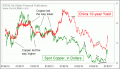
Copper Leads The Way Lower for Bond Yields |