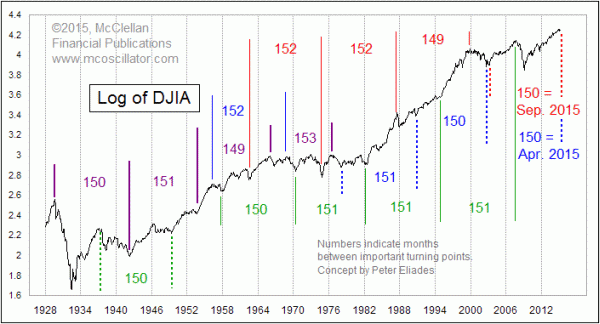
The Magic of 150 Months
Free Chart In Focus email
Delivered to you every week
In a recent article featured in our twice monthly McClellan Market Report newsletter, we featured the chart shown this week. It was inspired by some work done recently by famed technical analyst Peter Eliades, who has been a newsletter writer for many years and is the proprietor of www.stockmarketcycles.com.
The basic point is that a period of 150 months (12.5 years) shows up in lots of places as the time distance between several important turning points for stock prices. The price data in the chart this week is the log value of the monthly close of the DJIA. Using log scaling allows us to better see the turning points without the effect of arithmetic scaling interfering with the view.
Readers should understand that this is not meant to show a 150-month cycle persisting throughout history. Rather, it is an interesting coincidence that if you count forward by about 150 months from almost any major price turning point (high or low), you find another one, although not necessarily of the same type. There are probably even more such relationships than just the ones shown here.
As we noted in the newsletter article, the 150-month period is related to a longer 393-month turning point pattern by virtue of the Fibonacci ratio. Multiply 150 times 2.618 and you get 393. Alternatively, if you multiply 393 by 0.382, you get 150. It works backwards and forwards.
This is all relevant at the moment because we are arriving at the 150 month anniversary of the 2002-2003 lows. The Internet bubble’s collapse led to a big decline in 2002, and to a bottom in October 2002. But worries about an impending war with Iraq kept prices down, and we got another low in March 2003. So which one do we count from?
That’s the hard question. Counting forward 150 months from October 2002 gets us to April 2015. And 150 months from March 2003 gets us to September 2015. Split the difference, and we have May to July 2015, and that’s right where we sit now.
Understand that the 150-month figure has to be taken with a tolerance of plus or minus 2 months. Life is just not as precise as we might all like. And it is not yet clear which of the bottoms in 2002-03 was the one that the market thinks is the right one from which to count forward. We’ll know for sure in a few months, but for now we have to allow for either possibility.
Expecting a major top in 2015 fits well with the leading indication from the eurodollar Commitment of Traders data, as I discussed in the May 7 Chart In Focus. That analysis says that the top should be in early August, but there can be a little bit of wiggle room. Watching for the more precise topping indications is something we will be taking up in both our twice monthly McClellan Market Report and in our Daily Edition.
Tom McClellan
Editor, The McClellan Market Report
May 07, 2015
Eurodollar COT’s Leading Indication |
Jul 17, 2014
Fishing Around For a Gold Cycle Bottom |
Feb 01, 2013
How A Market Cycle Can Change |