Brightening Prospects For Employment
Free Chart In Focus email
Delivered to you every week
The federal government has thrown a whole lot of money at the economy in an effort to try and improve the unemployment situation. So far, those efforts have not gotten very much traction, leading to all sorts of discussions about the merits of government stimulus.
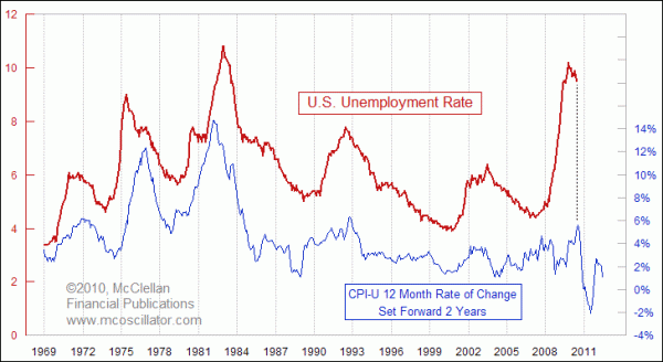
One look at this week's chart will help everyone who see it to understand why the unemployment rate has not yet shown much improvement. It is a simple matter of having to wait for the right time to arrive.
In the chart, I am comparing the inflation rate to the unemployment rate. Back in the 1970s, it was fashionable for economists and politicians to add these two numbers together to get what they called the "misery index". But the real relationship is revealed in this chart, which is that inflation LEADS unemployment by about 2 years.
The plot of the CPI inflation rate is shifted forward in the chart by 2 years to reveal that its movements tend to get echoed 2 years later in the unemployment rate. There has been a lot of discussion in the news lately about the way in which the unemployment rate is calculated, and how the current value of 9.5% is not really an accurate reflection of the real situation. My purpose here is not to open up that topic for debate, but rather to illustrate how the direction of movement for the unemployment rate (as reported) is related to the direction that the inflation rate was moving 2 years prior.
The inflation rate peaked 2 years ago this month, in July 2008. So if the 2-year lag worked perfectly, the peak of unemployment should occur in July 2010. But we can see that the reported unemployment rate has already turned down slightly; the reality is that peaks and troughs in unemployment do not always arrive precisely at the 2-year lag point. Two years just works the best in terms of the chart offset to get the best overall fit.
It would be fair to say that the drop in the inflation rate that we saw during late 2008 should mean a drop in the unemployment rate, starting right around now. Partisans on both sides of the political debate will assuredly attribute credit for such a drop to efforts undertaken in Washington, DC, and there is some truth to the idea that some of the things Congress does (or does not do) can influence the economy.
But the clear message from the chart is that if Congress wants to ensure a low unemployment rate, all it has to do is arrange for very low inflation, and then wait two years.
Tom McClellan
Editor, The McClellan Market Report
Nov 06, 2009
Civilian Employment Level (Follow Up) |
Dec 18, 2009
Drop in inflation should bring DROP in crime |
Jun 11, 2010
Proof The Double-Dip is Coming |