Gold Price is a Measure of Dollar’s Debasement
Free Chart In Focus email
Delivered to you every week
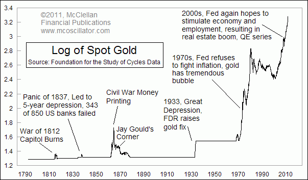
That headline is nothing new to most people, but you may never have seen such a long term view of gold prices before. This week's chart looks all the way back to 1792 at the value of gold expressed in dollars per ounce. If we assume that gold's real value stays constant over time, and that its price is a statement about the value of the dollar, then this chart is a good representation of the debasement of the dollar by virtue of how many more dollars it takes to buy an ounce of gold.
It is called "debasement" because when it happens, 'de value of 'de dollar goes down to 'de basement.
We have been going through a financial crisis since 2007 when the real estate bubble collapsed, and the Fed's efforts to resuscitate the economy have tripled the price of gold from its early 2007 levels. But the rise in gold prices was going on since 2001, long before anyone ever heard of "quantitative easing".
Looking at this long term chart also allows us to make a visual comparison of this current round of debasement, and other periods in history when the dollar's value changed dramatically. The scaling is logarithmic, which means that each increment of vertical chart space represents the same percentage move for prices. Calculating the logarithm of a number means that you are expressing that number as the exponent by which a base number (10 in this case) has to be raised to produce that number. So 2 on the Y-axis equates to $100/oz, 3 equates to $1000/oz, etc.
Being able to see gold prices in this way puts into perspective the modern round of dollar debasement, compared to other events in U.S. history. We might think we have it bad now, with unemployment north of 9%, but that pales in comparison to the estimated 37% unemployment rate in 1933, and also to the economic difficulties during the U.S. Civil War.
When talking about the price of gold, people typically use pricing units of dollars per troy ounce. But that convention is not the only way to look at the comparative value of gold versus the dollar. This next chart flips that relationship upside down, and looks at gold's price measured in ounces per $100. I could have used ounces per $1, but then there would just be longer decimal numbers in the Y-axis. I did not use logarithmic scaling on this one.
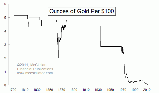
After the founding of the U.S., a hundred dollars would buy you 5.16 ounces of gold. Now, it buys you just 0.05405 ounces. Pushing this line down all the way to the basement is great for owners of gold, but lousy for owners of dollars.
Tom McClellan
Editor, The McClellan Market Report
Apr 15, 2011
The Gold/Wheat Ratio |
Apr 08, 2011
Bernanke Should Listen To Gold |
Nov 19, 2010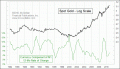
Is Gold Overvalued? |