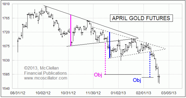
Gold’s Triangle Objectives Met
Free Chart In Focus email
Delivered to you every week
For this week's chart, I wanted to share a bit of analysis that I have been writing a lot about in our Daily Edition. Subscribers to that publication have been watching this situation in gold prices unfold in real time, and now that the price objective has been met it becomes a really nice lesson about one element of classical bar chart analysis.
Gold prices reached a peak back in October 2012, and then started a decline which has now taken off more than $200 per ounce from its price high. Partway down, gold prices reversed in November to form what would become a (mostly) symmetrical triangle. Triangles are indecision patterns, and I say that it was mostly symmetrical to mean that the slope of the declining tops line was roughly the symmetrical inverse of the slope of the rising bottoms line.
Triangles like this can be useful because they give us a measuring objective for the price move once we see a breakout from within the boundaries of the triangle. The height of the triangle is measured as shown by the solid pink link, and then that vertical distance is applied to measure from wherever the breakout point comes, either upward or downward. So in the case of that triangle, the roughly 100 point height gets subtracted from the point where prices broke down out of the triangle in December 2012 to produce a downside measuring objective of around $1585/oz.
One could calculate these numbers with more exacting precision, but to do so could create the misleading impression that prices will live up to that precision. Real life does not work that way, and so I have found that using approximations is much better, just to keep expectations in check. The idea is that you are getting an "objective", which is not the same thing as a guarantee. And prices don't have to stop just because they reach an objective; they can go on well beyond it.
Partway down from the breakdown out of that first triangle, gold prices paused to form what turned out to be another triangle structure. It was even more interesting that the formation of that second triangle involved two separate retests of the underside of the broken (solid) uptrend line from that first triangle. We can now see that prices broke down once again out of that second triangle, and so the blue lines are meant to show what the downside objective would be from using that second triangle.
Interestingly, that second triangle carried an almost identical message, calling for a downside objective just a little bit lower than the $1585 objective from the first (pink) one.
Now we see that both objectives have been met. I had been officially bearish for my "current opinion" on gold as published in our Daily Edition, but now with the downside objective reached and an obvious oversold condition evident, I exited to a "neutral" stance. I don't think it is time to catch the falling knife and bet on a big gold rebound, but at the same time I am out of arguments for why gold should continue lower. I will be updating that opinion in the Daily Edition as time moves forward.
There is one last point about using classic bar chart analysis techniques. Most of the classic Edwards and Magee style chart analysis ideas come from the days when they were developed for stock price charts. I am talking about chart structures like head and shoulders, rounding bottom, flags and pennants, triangles, triple tops, etc. It can be risky to just transplant those analysis techniques to a different market, especially commodities, and to then just assume that they will work the same.
The psychology of commodities markets, the bond market, currencies, etc. is much different from how traders think about stock prices movements. People don't buy stocks to consume them, like they do with oil or wheat; the only use for a stock is to (hopefully) earn dividends and capital gains from owning them. Accordingly, chart pattern analysis does not necessarily work the same in other markets, because the psychology which drives the patterns is different.
I ignore out of hand all head and shoulders structures outside of stock price charts because I have found that they are just not that reliable. One also cannot do the volume analysis piece as easily, which Edwards and Magee asserted was essential for validating or refuting a head and shoulders structure.
By looking at a lot of charts, I have satisfied myself that triangles "work" for gold prices as they did in this case. Anyone wanting to employ such charting techniques outside the stock market should put himself through a similar process of validating that they work in the other market before just assuming that they do.
Tom McClellan
Editor, The McClellan Market Report
Jul 27, 2012
The Real Cause of Higher Grain Prices |
Jan 08, 2010
The One Real Fundamental Factor Driving Gold Prices |
May 25, 2012
Gold Breaks Downtrend, Sort Of |
Apr 27, 2012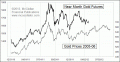
Gold Repeats A Prior Pattern |