The Real Cause of Higher Grain Prices
Free Chart In Focus email
Delivered to you every week
This week's chart involves a great analytical story, and I'm going to spoil the ending by putting it up front in this week's chart. The key insight is that sunspots are a big driver for wheat prices.
Various pundits are putting out stories blaming the drought in the plains states on global warming. For some people, it seems that anything that happens can be blamed on global warming, which may be why more Americans have started tuning out the global warming alarmists.
A better explanation for the drought, and the ensuing spike in grain prices, is that this is all part of the normal 11-year sunspot cycle. But to find that relationship in the data is what the story is about.
The first point to understand is that sunspot activity has now been scientifically linked to changes in cloud formation. When the sun is more active, the charge particles streaming out from sunspot activity help to sweep away cosmic rays that might otherwise hit earth's atmosphere, where they play a role in cloud formation. You can read a fascinating article about the leading researcher on this topic, Prof. Henrik Svensmark. And here is an interview with him from 2011.
Once you get past that more difficult scientific hurdle of understanding that cosmic rays and clouds are related, it is pretty easy to understand that less cloud formation is related to less precipitation, and thus poorer growing conditions for rain-irrigated crops. That is what we are seeing with this year's drought, and it has been pushing up grain prices accordingly.
Looking across the last hundred years of price data on wheat, it can be difficult to see the relationship between the sunspot number and wheat prices. Part of this comes from the fact that there are other factors which sometimes act upon crop yields and thus grain pricing. But a big factor is that the units we use to measure wheat prices, i.e. US dollars, can vary themselves, causing the relationship with sunspots to sometimes be disguised by what the dollar itself is doing.
If we look at the history of these two sets of data before the modern era of floating currency exchange rates, we can better see how they were correlated.
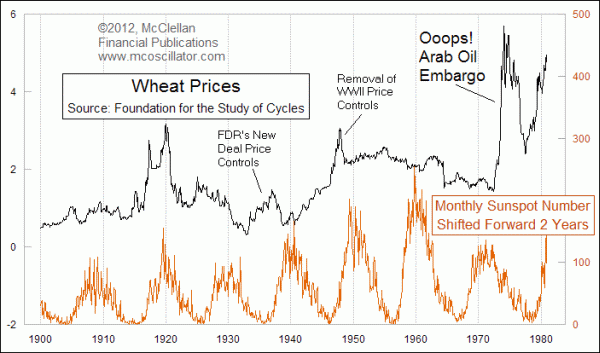
This chart shows raw wheat prices, unadjusted for the value of the dollar. The sunspot number data is shifted forward by 2 years to reveal that bottoms and tops in the sunspot number tend to be followed a couple of years later by bottoms and tops in wheat prices.
This relationship got into some trouble in the middle part of the chart, when President Roosevelt's New Deal price fixing artificially inflated wheat prices. The intention in the 1930s was to benefit farmers by keeping wheat prices up. That effort switched during WWII to the government putting a cap on all prices, including wheat, to support the war effort. Rationing of food, fuel, and other items took over for market forces.
Additional trouble came in the 1970s, when the Arab Oil Embargo pushed up oil prices in 1973-74, reducing acreage under cultivation. Then later in that decade, the rising value in the dollar pushed down the dollar price of most commodities compared to prices in other currencies. So using dollars to see the normal cyclical relationship in price data became problematic.
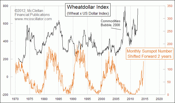
All of this explanation brings us (finally!) back to the lead chart above. In that chart, I have adjusted the dollar price of wheat, multiplying it by the US Dollar Index, which was created back in 1971. This mathematical step produces a unitless measure of the value of wheat by factoring out the dollar's movements. Doing this allows us to better see how the peaks and troughs in wheat prices have been related to the sunspot cycle. I want to emphasize again that the sunspot number is shifted forward in that chart by 2 years, to reveal its leading indication for how wheat prices will behave.
The conclusion from this is that the upward move in the value of wheat right now is just following the swoop upward in the sunspot number that began in 2009. We should expect to see generally rising prices for wheat and other grains until about 2 years after the sunspot cycle has peaked, a peak which has not even happened yet.
Tom McClellan
Editor, The McClellan Market Report
Nov 12, 2010
The Secret Driver of Unemployment |
Jun 29, 2012
Interest Rate Models Call For Lower Dollar |
Dec 23, 2011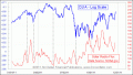
Are Traders Really Just Driven By the Sun? |
Apr 15, 2011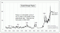
The Gold/Wheat Ratio |