Are Traders Really Just Driven By the Sun?

Free Chart In Focus email
Delivered to you every week
As you head off into the long holiday weekend (and I hope that yours is a joyous one), I thought I would give you something a little bit more fanciful to chew on.
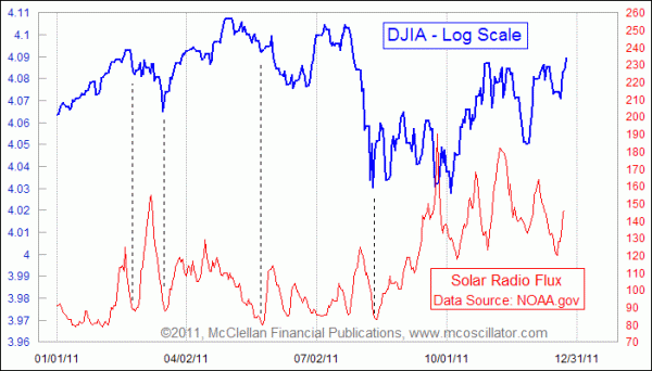
This week's chart shows an interesting correlation, or perhaps I should say that it is a troubling correlation. We have all been told by the financial media lately that the wild up and down movements of the stock market this year stemmed from investors' reactions to the various plans and announcements coming out of Europe, focusing on its debt problems. But here we are seeing that the ups and downs of the DJIA seem to match the rise and fall of solar radio flux.
Flux is a measure of the energy output of the sun, and is an excellent indicator of overall solar activity levels. It is associated with the 11-year sunspot cycle, but it varies a whole lot on a daily basis, as the chart illustrates.
So why could it be that rising solar flux would lead to rising stock prices, and vice versa? That is the deep and possibly troubling question. Some people have theorized that the fluctuations in the amounts of charged particles hitting the wiring in our brains can affect collective moods, just as they can affect electrical power grids and microcircuitry. That's as good of an explanation as any. I usually operate on the philosophy that if the correlation is good enough, no explanation of the root cause is necessary.
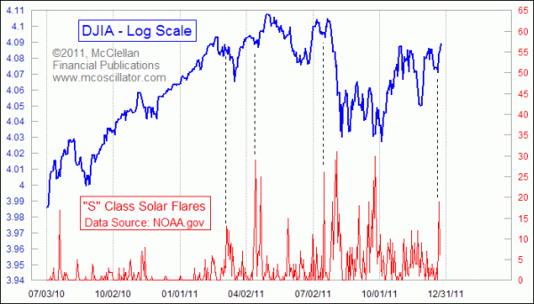
Here is something more to chew on: Perhaps it is not the radio flux that is really doing the job of affecting our brains' wiring, but rather the spikes in solar flares that seem to arise out of the low points in radio flux. This next chart looks at the counts of "S Class" solar flares.

You can see that the biggest spikes in the numbers of these flares tend to coincide with meaningful bottoms for stock prices. Those spikes also happen to arrive at minimum points for total radio flux, as if the surge in solar flares kicks off the next rising phase for that measure of solar activity. The DJIA's rise up out of the minor price bottom on Dec. 19, 2011 coincided with an upward surge in the number of these S-Class flares. Other spikes in flares in 2011 have also coincided with important lows, although not all price lows have flare spikes to explain them.
One trouble with identifying this relationship is that it is not much good for those of us in the forecasting business. The relationship between solar activity and stock price activity seems to be a coincident one. We know that it is related to the 11-year sunspot cycle, but even that cycle can vary from 9 years to 14 years. Forecasting solar weather on a daily basis has proven to be very difficult.
You can access the historical data at NOAA's web site and play with the numbers yourself if you are curious enough to delve into this. You can also get daily updates at http://www.spaceweather.com/.
I am certain that a lot of readers will have trouble accepting the idea that stock prices could in any way be driven by changes in solar activity. I have some trouble accepting it myself. But every once in a while, it can be worthwhile to take a look at a wild idea just to see if there is any merit to it. The evidence here seems to be strong enough to demonstrate that there is something going on there, even if it is not good enough to figure out how to make money off of it. One possibility is that if you see a big solar flare that is bigger enough than what has been happening around that time, then it is an invitation to a stock price rally in the days that follow. But putting that effect into quantifiable terms and actionable information is more elusive.
Tom McClellan
Editor, The McClellan Market Report
May 20, 2011
NY Investors Should Learn To Like The Rain |
Mar 25, 2011
Oil Predicts Stock Market Dip |
Nov 12, 2010
The Secret Driver of Unemployment |
Aug 06, 2010
Correlations May Not Be What They Seem |