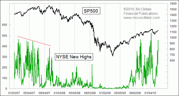
NYSE’s New Highs Confirm Uptrend
Free Chart In Focus email
Delivered to you every week
The numbers of stocks making new 52-week highs or lows is one piece of data that technical analysts like to watch, but which does not always have a relevant message. Some days it gives us a great message, while other days it remains quiet. With the big rally on March 5, following the monthly Employment Situation report, we are getting important information about the market's future from examining the number of new highs.
This week's chart focuses only on the number of new highs, ignoring the numbers of new lows. Since only 1 stock made a new 52-week low on March 5, there is not much information there. Similarly, there was not much information in the miniscule numbers of new highs during late 2008. Each has its own importance at different times.
As a new uptrend progresses, one of the things to look for is the number of stocks making new 52-week highs continuing to grow. This shows increasing participation in the uptrend. When we see new price highs for the major indices on diminishing peaks in the number of new highs, then that shows a decline in the participation in that rally, and it is a worrisome sign. We don't have that sign at the moment, and instead we are seeing rising numbers of new highs on the advance out of the Feb. 9, 2010 correction low.
At the point when we finally see a divergence appear, meaning a higher high for the DJIA or SP500 but a lower high on the number of stocks making new highs, that will be the time to start getting more concerned, but it will not necessarily be the end of the uptrend. Back in 2007, at the left end of the chart, the number of new highs was in a long period of decline before the final price high of that bull market was seen in October 2007. By the time that final price high arrived, the new highs total was noticeably lower than at previous peaks earlier in the year. And the number of new lows (not shown) was starting to increase during ordinary price corrections. Both indications were warning signs that stocks were having trouble continuing the advance. Late 2007 also saw the NYSE Advance-Decline line making divergent lower highs.
That is not the situation we face right now. Each up surge in the market continues to draw in more participation, and more stocks making new highs. Advance-Decline numbers are strong, telling us that liquidity is plentiful. Someday, it will again be time to worry about slowing participation in the uptrend, but now is not that point.
Tom McClellan
Editor, The McClellan Market Report
Jan 01, 2010
Nasdaq A-D Line “Divergence” |
Nov 20, 2009
NDX A-D Oscillator |
Oct 16, 2009
A-D Line Has the Story on Corporate Profits |
Oct 30, 2009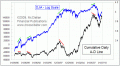
A-D Line Back Near All-Time Highs |