Perhaps The Only Chart That Matters (For Now)

Free Chart In Focus email
Delivered to you every week
There are a lot of different indicators and studies that technical analysts use, and all of those tools came into usage due to some degree of merit. But the one factor which seems to be trumping everything else lately is what the Fed is doing with its QEternity program, which shows no sign of stopping anytime soon, or maybe ever.
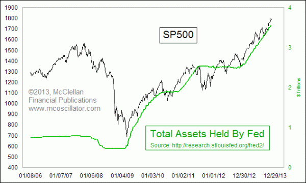
This week's chart compares the SP500 to the total assets held by the Fed. That plot is made up from the total of the Fed's Treasury holdings and its mortgage backed securities (MBS), which are sometimes referred to as "agency" debt products. The agencies which that title refers to are Fannie Mae, Freddie Mac, etc.
Putting the chart together this way helps us see just how important the Fed's purchases have been to the task of sustaining the bull market for stocks. Whenever the Fed has decided to change the slope of the green line, the slope of the SP500 has also changed in a dramatic way. That makes it such an important question to contemplate a "tapering" off in the rate of growth of Fed assets, or even an outright end to quantitative easing (QE).
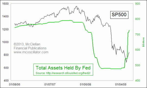
This chart also helps us see just how critical the Fed's actions were in bringing about the awful bear market of 2007-09. Back then, the Fed just held Treasuries, and it did not start buying agency debt until January 2009. The Fed's holdings of Treasury debt peaked in August 2007 at $790 billion, and over the next 17 months the Fed sold off more than $300 billion of those holdings. That's right, in the middle of the worst liquidity crisis in decades, with banks folding and with Congress handing out tax rebates, the Fed was pulling liquidity OUT of the banking system.

When the Fed finally stopped pulling liquidity out of the system and started adding it back in again in early 2009, the market turned upward, and the banking system and economy started working their way back toward health again.
Given the now obvious importance of the Fed's actions on financial market liquidity, why did they decide in 2007 and 2008 to pull so much money out of the system by selling so much of their Treasury holdings during that bear market? That will be a great question for the historians to uncover. But what I can say is that the man who orchestrated and conducted those sales, the former president of the New York Fed, left that job in early 2009 to become the new Treasury Secretary. So you can draw your own conclusions.
Will all of this QE someday bring us inflation? Of course it will, because it already has. In recent decades, many people including Fed officials have come to think of "inflation" as what happens to consumer prices. But the original definition of inflation refers to the excessive expansion of the money supply. QE is inflation. So far, innovation and productivity gains are keeping prices from running away in step with the growth in the money supply. But rather than allowing consumers to enjoy the benefits of those lower prices, the Fed is confiscating that benefit for its own purposes, insisting on 2% annual growth in consumer prices instead of the "price stability" mandate given to the Fed by Congress.
When will it all end? That is a hard question, because it goes to the thinking and the decisions of the 12 voting members of the FOMC. As a markets analyst, I am accustomed to analyzing the collective decisions of millions of people. THAT can be modeled. Forecasting the decisions of 12 people is a much harder task.
But it is worth noting that back in 2007, the A-D Line actually peaked 3 months before the Fed's Treasury holdings peaked. And the April 2010 stock market top preceded the end of QE1. Likewise, the market peak in 2011 arrived before the end of QE2. So it is not reasonable, given these historical events, to conclude that one can just wait to hear news about the end of QEternity in order to know when the top for stocks is going to arrive.
Tom McClellan
Editor, The McClellan Market Report
Feb 14, 2013
Fed’s POMOs Keep Market Aloft |
Oct 29, 2010
POMO: The Hot New Timing Tool |
Oct 04, 2013
Summation Indices’ Messages |