Fed’s POMOs Keep Market Aloft
Free Chart In Focus email
Delivered to you every week
The genuine old saying is that "A fool and his money are soon parted." The more modern version is, "A fool and his money are SOME PARTY!" That latter one seems to be the theme for the stock market in recent years, as the Fed's efforts to avoid a repeat of the 1930s by printing more money have at least kept the stock market aloft.
The Fed's efforts have thus far not done much to keep the unemployment rate from repeating what happened in the 1930s. But at least those who are still employed are contented with their 401Ks. But the risk for investors is that a stock market whose only support agent is the Fed printing money is one that is big danger of trouble should the printing presses ever slow down.
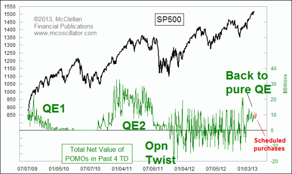
The Fed's first effort at "quantitative easing", known as QE1, added money to the banking system through "Permanent Open Market Operations", or POMOs. That effort ended in March 2010, and the stock market did not survive long after being weaned off the easy money. The illiquidity which resulted from shutting off that flow of new money resulted in the Flash Crash in May 2010. The stock market really did not find its footing again until the Fed announced QE2 in July 2010, and started pushing that money into the banking system beginning in August 2010.
The Fed tried to wean the banking system off that extra money again in June 2011, paring its purchases of Treasury securities back to just reinvestments of the interest payments it earned. The market did not like that, and the SP500 dropped 17% in just 3 weeks during July and August 2011.
In response to that illiquidity event, the Fed decided to get imaginative, and it started "Operation Twist" in lieu of a pure QE effort. The idea was to change the yield curve by selling shorter term debt instruments and buying up longer ones, thereby dropping yields on long term Treasuries and by association on mortgage rates. On alternating days, the Fed would buy and sell securities in amounts ranging from $1 billion up to $8 billion. Overall this helped the stock market, but the habit of separating the purchases and sales actually caused some sloshing of the money supply in interesting ways.
I was able to create an interesting indicator that looked at the amounts and dates of the Fed's announced purchases and sales, and use it to model what was ahead for the stock market. This next chart shows how I did that:
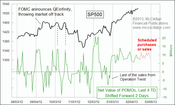
The purchases and sales seemed to show up a couple of days later in the movements of the stock market. The lower indicator shows total net purchases or sales over the prior 4 days, and it is shifted forward by 2 trading days to illustrate how the stock market follows those movements. The Fed has even been nice enough to publish a schedule of its intended purchases and sales up to a month ahead of time.
What is interesting right now is that the last of the sales was done on Dec. 20, 2012, and since then it has been only purchases, which means that the cash has been flowing in only one direction - - into the banking system. The response has been an abnormally steady and linear uptrend for the SP500.
That's all fine for investors for as long as the Fed keeps the party going. But now that the market is relying so much on these fund flows, any interruption or even a hint of an interruption in those flows would leave the market overbought and at risk of a big drop. As investors who have gone all in to ride this nice linear uptrend start to get twitchy, we could see a rush for the exits much like what we saw in July and August 2011. In fact, I am looking for just such an event.
So far, Fed officials have not given any hint of an interruption in the money flows, and in fact they have stated that it should continue until the unemployment rate drops to 6.5%. So the market's built-in presumption is that the party will go on indefinitely. That sets up the very big risk of a sudden change in attitudes any time there is a hint of a change at the Fed. Smart investors already know this, and will be inching their way over toward the exits, so that they can jump out ahead of the rush.
Tom McClellan
Editor, The McClellan Market Report
Oct 29, 2010
POMO: The Hot New Timing Tool |
Oct 07, 2011
Lumber Contango Spells Economic Rebound |
Dec 20, 2012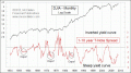
Steep Yield Curve Does Not Offer Complete Immunity |