Presidential Cycle Inverting?
Free Chart In Focus email
Delivered to you every week
When Dorothy went over the rainbow, she found that everything was backwards. The world had been colorized, munchkins were grateful that it was raining houses, scarecrows could talk, a lion was a fraidy-cat. And there was a wizard who was in charge of the whole place.
A new wizard is about to be in charge of the Fed, and that factor seems to be making the stock market turn backwards and upside down.
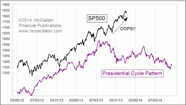
Our Presidential Cycle Pattern is a representation of the market's average performance over each four-year period from presidential election to election. It is not just a message about what the president does, but also about the whole political calendar as influenced by Congress, the federal fiscal year, and other factors. I like to measure it from the November election rather than from January 1, since the market typically starts responding to the election results as soon as they are known. Usually that means right away; the 2000 election was a rare exception.
The Presidential Cycle Pattern often gives a good model of which direction prices should go, and when turns are likely. But as an average pattern, some years are better and some are worse. And sometimes, the market pays attention to other factors besides what the politicians are doing. We appear to be in one of those exceptional situations now.
On average, the SP500 peaks in July of the first year of a presidential term, and then spends the next 16 months chopping sideways to downward until the mid-term election. But the current market is ignoring instructions and just continuing higher, presumably in response to the Fed continuing its money-pumping into the banking system. What is the problem?
More than just zigging upward when it is supposed to be zagging down, the market seems to be doing precisely the opposite of what the Presidential Cycle Pattern (PCP) says it should. Here is a closer in look:
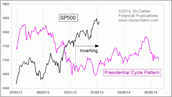
Zooming in closer allows us to see that even the minor pattern of the SP500 is doing a pretty good approximation of exactly the opposite of what the PCP says should happen. The stock market was supposed to be bottoming at the end of December, but instead it made a top. Now in January 2014, the market is supposed to be moving upward, but appears to be chopping downward.
What are we to infer from this? The PCP is all about the 2/4-year political calendar in Washington, DC, which has often had a big effect on pushing the market around. But Congress and the White House are not the big forces influencing Wall Street at the moment. Instead, the Fed seems firmly in charge. A different agent might perhaps mean a wholly different schedule, wholly uncorrelated to the "normal" pattern. But instead, forces are conspiring to bring about a seemingly precise inversion of the pattern.
How long the inversion can persist is not known at this point. And the installation of Dr. Yellen as the new Fed Chairman adds an additional unknown factor into the mix. I have seen the market make tops and bottoms early or late by a few days compared to the PCP, but I cannot recall seeing a complete inversion like what appears to be happening. In other words, we have a wholly irregular market right now that is not following the normal rules. It is instead following some other set of rules, and so extra caution is in order.
The 1929 scenario discussed in a Dec. 12, 2013 Chart In Focus article still appears to be "working", and that chart was updated in a recent issue of our twice monthly McClellan Market Report newsletter, which is available to subscribers. I do not think that we are in for an event of the same magnitude as 1929's crash and subsequent decline, but the imposition of "crash physics" on the market could be a possible explanation for the inversion we are seeing. Just as compasses have been reported to swing wildly upon entry into the Bermuda Triangle, perhaps the entry into a 1929-style crash scenario is flipping the market's polarity for a while. Caution is clearly in order at a time when the market just is not acting normally.
Tom McClellan
Editor, The McClellan Market Report
Dec 12, 2013
A Review of Analogs |
Nov 05, 2010
Entering the 3rd Presidential Year |
Sep 27, 2013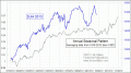
Seasonal Pattern |