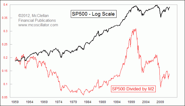
SP500 Undervalued Versus M2
Free Chart In Focus email
Delivered to you every week
The 40-year cycle for the stock market is not due to bottom until around 2022, and so between now and then it gives us the expectation of a sideways decade for the stock market, much like the 1970s or the 1930s.
At the same time, the leading indication for the stock market that is given by oil prices says we should see a strong upward trend for stock prices during the 2010s. These two expectations are in conflict with each other, but I think I can resolve that conflict with this week's chart.
It looks at the SP500 Index level divided by the value for the monetary aggregate measure known as M2. For the uninitiated, M2 consists of all of the currency in circulation and in bank vaults, plus travelers checks, demand deposits, other checkable deposits, savings accounts, and money market funds. It is a commonly used measure of the total amount of "money".
When it comes to analyzing the overall stock market, I like to say that there are only two fundamental factors which matter. Forget earnings, dividends, book value, revenue, etc. When it comes to analyzing the overall stock market, the only two factors which matter are (1) How much money is there? and (2) How badly does that money want to be invested?
That's where this week's chart comes in. The Fed has been inflating the money supply in order to resuscitate the US economy. Over the past 12 months, M2 is up 9.8%, and it has doubled since 2000. So in terms of fundamental factor #1, the Fed is doing all it can to help lift the stock market.
But that money has not been feeling inclined to go to work pushing up stock prices, and the result is that this ratio of the SP500 to M2 is now back down to levels it saw during the big bull market of the 1980s. And if the Fed keeps on inflating the money supply, as Fed officials have stated is the goal, then that will push this ratio down even further.
So that's how we can get a big uptrend for stock prices during the 2010s like the oil price leading indication suggests we should see. But that is not necessarily a good thing, because along with all of that money supply growth comes inflation in consumer prices. So far, the Fed keeps saying that inflation has remained low, but that is due in large part to the fact that housing makes up a 41% weighting in the Consumer Price Index (CPI). If you factor out the depressing effects of the weak housing market, the price inflation in all of the other CPI components has been as high as 5% recently.
One way to have stock prices go up is to have the companies backing those stocks become more valuable. But another way is to have the dollars needed to buy those stocks become less valuable, so that you need more dollars to buy your favorite stock. That appears to be the path that the stock market is now on, which explains how we can have a rise in stock prices in this decade, but not in real stock values.
Tom McClellan
Editor, The McClellan Market Report
Jan 13, 2012
RASI Above +500 Says Bull Market Not Done |
Mar 25, 2011
Oil Predicts Stock Market Dip |
Sep 02, 2011
Weak Housing Data Conceals Real Inflation |
Nov 19, 2010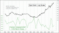
Is Gold Overvalued? |