TICK: Not Just a Bloodsucking Insect
Free Chart In Focus email
Delivered to you every week
One piece of market data called the TICK is a fairly obscure but wonderfully powerful market indicator. It measures the difference between the number of stocks currently trading on an uptick versus those trading on a downtick. An uptick means that the direction of the last intraday price change is upward.
For an individual stock to be on an uptick used to be a terribly important topic, because up until 2007 there was a rule that stocks could not be sold short unless they were on an uptick. This was intended to keep short sellers from ganging up and causing a cascading price decline. The SEC decided to eliminate that rule in 2007, supposedly because there are now other ways of dealing with that issue, but more importantly because with so much more trading going on now at very high speeds, and on different exchanges, it is difficult to tell from one nanosecond to the next whether an individual stock is on an uptick or not. The timing of that decision was interesting, just before the biggest bear market in years, when cascading short selling was a big feature.
In spite of this problem for individual stocks, the TICK is still a useful measure for the overall market. I like to watch it intraday on a 5-minute bar chart. Extreme readings occur when it goes beyond +/-1000. It also makes for nice intraday divergences.
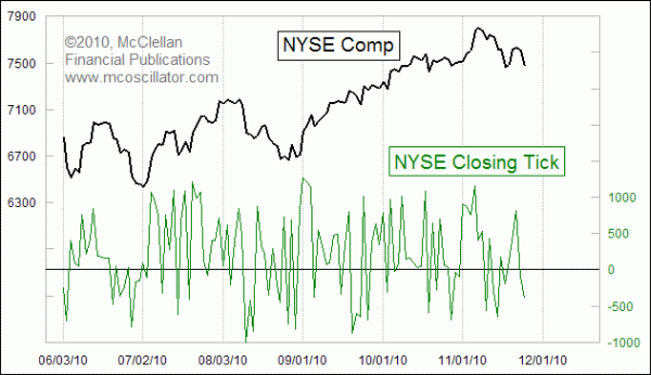
This week's chart looks at the closing value for TICK. It might seem unusual to pick out one single moment of the whole trading day, and use that as a snapshot for what the market is doing. But at the closing bell, the TICK reflects what is happening to the balance between buying and selling pressures at the close. If there are more "market on close" buy orders than sell orders, that will show up in the closing TICK value.
The daily chart of the closing TICK can be pretty noisy. So if we smooth it with a 10-day simple moving average (10 SMA), we can start to see the effects of trends in the data over a period of several days. This next chart shows that 10 SMA along with its own 10 SMA.
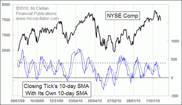
One observation that jumps out immediately is that there is a positive bias to this data. It tends to be above zero more than below. That's not wrong, nor a problem. It is just a feature of the data to acknowledge and adjust ourselves. Readings down around zero, or above +400, indicate nice oversold or overbought conditions for stock prices.
We can also see interesting information when the 10 SMA jumps far away from its own moving average. To see that better, this next chart measures the amount of deviation of the TICK's 10 SMA from its own moving average. This factors out that positive bias in the raw data, and gives us a nice overbought or oversold oscillator.
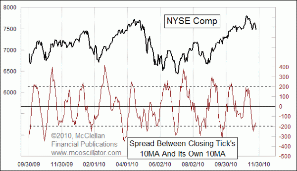
The post-election selloff has taken this indicator down to a nice oversold reading. Like any other oversold indication, this indicator's oversold reading is no guarantee that the market has to start upward again. It is just one more piece of evidence to consider when doing your own chart interpretation.
Next week, we'll take a look at how to use TICK on an intraday basis.
Tom McClellan
Editor, The McClellan Market Report
Mar 19, 2010
10 to 1 Up Volume Shows Initiation |
Mar 05, 2010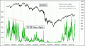
NYSE’s New Highs Confirm Uptrend |
Oct 30, 2009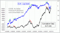
A-D Line Back Near All-Time Highs |
Dec 03, 2010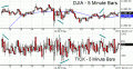
Using the TICK Intraday |