Yield Curve’s Effect Thwarted By Fed’s Actions
Free Chart In Focus email
Delivered to you every week
The Fed’s fingerprints are all over the charts. Whether or not that is a good thing depends upon one’s point of view.
The yield curve still matters, in spite of former Fed Chairman Ben Bernanke’s 2007 assertions to the contrary. During testimony on February 14, 2007 before the Senate Banking Committee, the following interchange took place:
Senator Bunning: "You are telling us today that an inverted yield curve down the road will not affect the economy. Did I misunderstand that, or is that accurate?"
Fed Chairman Bernanke: "I think the yield curve could be inverted for a considerable period without significant implications for the economy as a whole, yes--- possibly for some banks, but not for the economy as a whole."
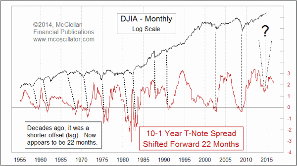
What former Fed Chairman Bernanke failed to understand, and what some economists do not understand, is that there is a significant lag between changes in the yield curve and its effects on the stock market. The recent data show that the lag is 22 months at the moment, although it has been a different amount of time in the past.
The chart above uses a simplified model of the entire yield curve, substituting the spread between the 10-year and 1-year T-Note rate for the entirety of the maturity spectrum. This obviously leaves out other information, but makes for a convenient stand-in for the purposes of evaluating the yield curve versus other time series. The 10-1 yield spread plot is shifted forward by 22 months, which gives us the best fit to what stock prices have been doing in recent years. The 2009 stock market bottom was right on schedule, given this 22 month lag. The economic damage from the inverted yield curve in 2007 was still occurring, even though Dr. Bernanke could not see it. The real estate bubble was masking the damage somewhat, but it was still there, and in 2008 we found out just how wrong Bernanke was about how damaging the inversion of the yield curve was.
A 22-month forward offset works well now in this chart. Back in the 1950s to the 1970s, it was a much shorter time offset that explained stock price movements much better. Why the lag has lengthened is a fascinating question, and I do not have an adequate answer. The inability to answer that question, though, does not prevent us from seeing what the interrelationshp has been.
The curious point about this relationship is that it seems to have thoroughly broken down in 2013-14. The 10-1 yield spread had said we should have expected to see a dip in 2014, and aside from the minor but scary Ebola Panic dip in September-October 2014, there has not been much of an interruption to the stock price uptrend. That Oct. 2014 bottom does not even show up in this chart because I am using monthly closing values for the DJIA, and the Ebola Panic bottomed in mid-October.
So what happened to that 2014 dip? The easy scapegoat is the Fed, whose QEternity program kept pumping $85 billion per month into the banking system for many months. The Fed eventually tapered that down to nothing as of October 2014, except for the reinvestments of interest which continues to be earned on the nearly $4.2 trillion of Treasury and mortgage debt that the Fed holds. If we had not gotten all of that QE, the stock market should have been able to exhibit the normal echo of the dip in the 10-1 yield spread 22 months earlier.
Looking ahead, the peak in this yield spread equates to a top for stock prices in Oct. 2015.
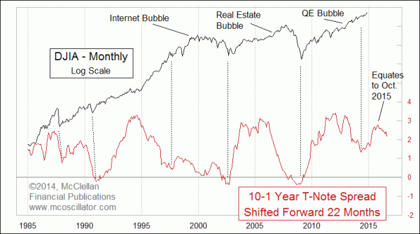
The point to understand about that peak, however, is that the DJIA does not correlate as well to where the peaks appear in this leading indication. The alignment of the bottoms works much better. So if the Fed ever does allow short term interest rates to rise, and if the FOMC is foolish enough to invert the yield curve again, then we can look ahead to seeing an important bottom for stock prices about 22 months later. For now, however, it is still a bull market.
Tom McClellan
Editor, The McClellan Market Report
Jan 30, 2014
Yield Spread Model Calls For 2014 Stock Market Low |
Feb 20, 2014
Yield Curve’s Message For GDP |
Oct 23, 2014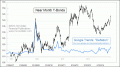
Deflation Is Getting Too Popular |