Yield Curve’s Message For GDP
Free Chart In Focus email
Delivered to you every week
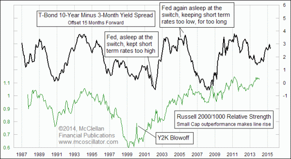
One of the really fun leading indication relationships involves the yield curve, the spread between interest rates on similar securities across different maturities. The real yield curve has too many data points each day for visual modeling, and so a simplistic model of the yield curve can suffice to make for easier modeling. In this week's chart, the role of the entire yield curve is portrayed by the spread between the 10-year T-Note yield and the 3-month T-Bill yield.
The fun thing that we get from this representation of the yield curve is a leading indication of what small cap stocks will do versus large caps. Playing the role of each market segment are the Russell 2000 and Russell 1000 Indices. Dividing one by the other gives us a relative strength ratio, which moves up or down as small caps outperform or underperform.
Historically, the movements of the yield curve (as represented here by the 10-year to 3-month spread) get echoed about 15 months later in the movements of this relative strength ratio. And that same 15-month lag period also shows up in other data. Here is a comparison of that same yield spread versus GDP growth:
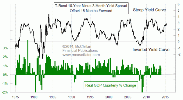
Once again, the plot of the 10-year to 3-month spread has been shifted forward in the chart by 15 months. This helps to reveal how periods of higher spread between long and short Treasuries gets echoed about 15 months later by stronger GDP growth. And when the yield curve "inverts" and takes this spread down close to or even through zero, we see a corresponding dip in GDP growth about 15 months later.
We have a lot of years of history to show that this relationship works pretty well. But the difficult question is whether it still works now that the Fed is pursuing a centrally managed interest rate market. Economist Alexander Tabarrok had a great quote about this several years ago. In a Forbes magazine interview, he said, "A price increase is a message about scarcity. Price controls are like shooting the messenger."
By manipulating the short end with its zero interest rate policy (ZIRP), and by manipulating the long end with more than $4 trillion of US Treasury bonds and mortgage back securities purchases, the Fed just may be killing the messenger, and ruining a great leading indication. Ever since the Fed became more active, following the 2008-09 depression, the correlation has not been working as well. The recent swoop upward in this yield spread should mean small cap outperformance and rising GDP growth into early 2015, but that is only if one is prepared to believe a manipulated interest rate model.
Tom McClellan
Editor, The McClellan Market Report
Jan 30, 2014
Yield Spread Model Calls For 2014 Stock Market Low |
Nov 21, 2013
Perhaps The Only Chart That Matters (For Now) |
Dec 20, 2012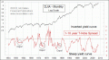
Steep Yield Curve Does Not Offer Complete Immunity |