Yield Spread Model Calls For 2014 Stock Market Low
Free Chart In Focus email
Delivered to you every week
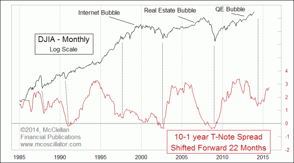
The QE bubble has kept the bull market rolling longer than it was supposed to. This is similar to the Internet bubble top for the stock market in 2000, and the real estate bubble top for stocks in 2007, both of which arrived later than they were supposed to.
The chart this week updates one I showed back in December 2012, exploring how the spread between the 10-year and 1-year Treasury yields can provide a leading indication for where stock prices are going to go approximately 22 months later. It is not a perfect leading indication (I'm still looking for THAT), mostly because in a bubble the stock market can continue higher even after this messenger says it is supposed to turn down.
We saw that quite well back in 2000. The Internet bubble pulled up stock prices to their highs in 2000, even though the Advance-Decline line had peaked in early 1998. But the 2002 market bottom arrived on schedule.
Similarly, the real estate bubble which peaked in 2005-06 still saw stock prices continue up into 2007, but eventually the piper was paid and the 2009 stock market bottom arrived on schedule.
This yield spread model said that the stock market should have peaked back in late 2011. But the continuation of QE has kept the bull market going on longer than it was supposed to, just like in 2000 and 2007. Both of those ended badly, all the more so for having been continued longer than they should have.
Now we find ourselves in another episode of the Fed trying to keep the balloon aloft longer than it deserves to be kept that way. If things play out this time in the same way as the last two bubbles, then the bottom which the yield spread calls for should arrive on time, sometime in mid-2014. Tops can arrive late, but bottoms seem to come in with punctuality. The yield spread bottomed in July 2012, and so 22 months forward equates ideally to May 2014, but some degree of time tolerance should be allowed on either side of that date.
This yield spread model had called for a meaningful bottom back in the autumn of 1997, and the monthly plot does not show much of a bottom then. These monthly closes conceal the 13% decline that year, including a 7.2% mini-crash on Oct. 27, 1997, right on schedule for the turn as called for by this model.
The good news for market bulls is that stock prices are poised to turn upward into 2015, based on this yield spread having turned up 22 months earlier. How much of an upturn is not something for which this model gives an answer. It only tells us about direction, and poorly at that going into major tops when the Fed has a thumb on the scale. For now, however, it says that there is a decline still on the agenda, toward a bottom ideally due around May 2014.
Coincidentally, that is the same message being offered by the 1929 analog, first discussed in November 2013, and updated again here, as well as for subscribers to the McClellan Market Report and also our Daily Edition.
Trouble's coming, but there is also a bright side several months ahead.
Tom McClellan
Editor, The McClellan Market Report
Dec 27, 2012
Another Use For the Yield Curve |
Nov 21, 2013
Perhaps The Only Chart That Matters (For Now) |
Jun 06, 2013
Hindenburg and Titanic, OH MY! |