Coppock Curve Turns Down
Free Chart In Focus email
Delivered to you every week
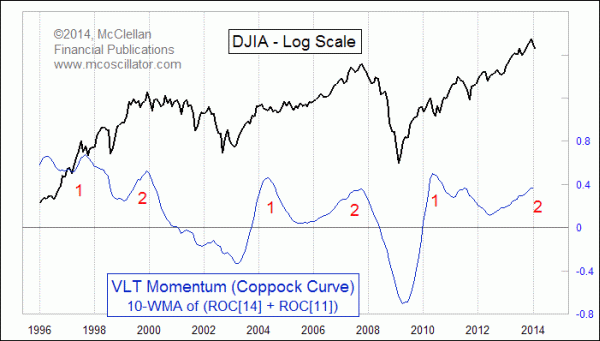
A classic technical indicator gave a rare bearish signal for the DJIA with the down move seen in January. The Coppock Curve has turned down. More importantly, it has done so after a second big top, which seems to be the important set of dance steps to mark a major market top.
Named for the late Edwin Sedgewick Coppock, his eponymous indicator was originally developed as a way to find the upturns from major stock market bottoms. But with the right interpretation, it can also have other uses.
Coppock was a market analyst and money manager a few decades ago, and was awarded the MTA's Lifetime Achievement Award in 1989. The indicator that bears his name now was something he himself called his Very Long Term (VLT) Momentum indicator. It was based on an idea which originated from a conversation Coppock had with bishops of the Episcopal church. Coppock asked how long it takes a person to grieve, and to get over the loss of a loved one. The answer was 11-14 months.
So Coppock incorporated that answer into his indicator, which combines 11-month and 14-month rates of change for the monthly closes of the DJIA, and then smoothes that with a 10-month weighted moving average. Technicians who later took up the use of Coppock's VLT Momentum indicator gradually changed the reference to "Coppock Curve", to honor its creator.
When the Coppock Curve gets down to a very low level and then turns up, it signals an important long term entry point. Coppock was a money manager who wanted to find the really great long term buy signals, and was not so much interested smaller swings. The most recent such signal came in May 2009, just after the March 2009 bear market bottom, and it was indeed a great long term entry point.
After it gives such a signal, the subsequent uses of the Coppock Curve are not as clear cut, and it was not originally meant to offer other interpretations of the market action. Tops are especially tricky, because sometimes a downturn from a high reading is a big bearish signal, and other times it does not mean that much. This week's chart highlights an interesting recent behavior of the market and this indicator, which is to give a two-step long term topping condition. Or at least that has been the case in the limited number of market cycles since the late 1990s.
Now we have a downturn from a second top, as of the end of January 2014. That completes this iteration, and arguably sets the market onto the course of a long term corrective move. Given the math of the Coppock Curve, it will be a long time before we can get another upturn.
To help visualize this principle, the next chart compares the DJIA to the price level needed to achieve a reversal in the Coppock Curve, what I call the "Coppock Unchanged" value.
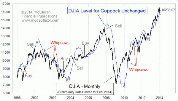
When the DJIA crosses down through the Coppock Unchanged line, that turns down the Coppock Curve. If such a move happens at a major top, it is a pretty unequivocal signal. But crossings at other points can give whipsaw signals as with any other type of trend following indicator. To get back up on top of the Coppock Unchanged line and turn up the Coppock Curve, the DJIA would need to close above 16238.07 at the end of February 2014, and that number keeps on rising.
So is this January 2014 downturn a legitimate signal, or just another whipsaw? That's the important question. But consider that the DJIA has now completed the familiar 1-2 topping pattern seen at the major tops in 2000 and 2007. And this arises at a time when the stock market still appears to be following the 1929 top's price pattern, albeit with a much smaller overall magnitude of price movement, and the Fed is pulling away the QE punchbowl. That adds up to a compelling case for a meaningful top and downturn.
You can calculate your own Coppock Curve series with this spreadsheet. See also Calculating The Coppock Curve.
Tom McClellan
Editor, The McClellan Market Report
Dec 12, 2013
A Review of Analogs |
Nov 21, 2013
Perhaps The Only Chart That Matters (For Now) |
Sep 19, 2013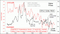
A Cooling Planet Means Price Inflation |