Deflation Is Getting Too Popular

Free Chart In Focus email
Delivered to you every week
I cannot believe the volume of the news stories I am seeing in the financial media, with people worrying about impending deflation. And as any card-carrying contrarian knows, when a topic gets too popular, you are near a turning point.
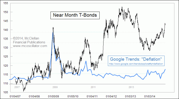
To check that observation, I went to Google Trends and did a quick search on the term “deflation”. What Google does is to then come back with a chart showing interest in that term over time among the news media. And sure enough, October 2014 is showing the highest reading since late 2010, and the month is not even over yet. As I see it, that confirms that the media are getting a little bit too interested in this topic of deflation.
So what? Well, when “everyone” is expecting deflation, they usually place their financial bets based on that expectation. And that usually takes the form of T-Bond prices going too far. So to verify that notion, I took that Google Trends chart and overlaid a chart of T-Bond prices for the same period.
There are ways to create a more elegant chart comparison, but Google does not make it very easy to get the raw monthly readings unless you are willing to hover your mouse cursor over every point on the chart, note the value that the Flash graphic pops up, put that into a spreadsheet, and then adjust the chart settings accordingly. So I went more old school, and did it like we used to in the days of acetate transparencies on an overhead projector. I made the background of the T-Bond price chart transparent, and laid it over the Google Trends chart, stretching and adjusting the bond chart as needed to get the timelines to line up.
The result is a crude but workable overlay which allows us to see that when the subject of “deflation” gets really popular in the press, that tends to mark a top for T-Bond prices. How much of a top may be different from one instance to another, but the principle is relatively consistent.
This is similar to another comparison I featured here back in 2012 comparing actual oil prices to the frequency at which the term “oil prices” had been featured in news stories. A high frequency of mentions usually coincided with high oil prices, although sometimes it could also be a sign of abnormally low oil prices.
You can play around with Google Trends to find the different rates of popularity of different terms, and if you do you will probably see a larger number of gross headline counts involving the words “Bieber” or “Kardashian” versus “deflation”. I’m not sure of what financial data to attempt to correlate to the varying interest in the Kardashians. The term “New York” shows a generalized downward trend. But “Dubai” is trending upward. Playing around with it can get addictive.
The basic point for beginning contrarians is to disbelieve most of whatever you are hearing repeated in the financial media. And the more it is being repeated, the more you should disbelieve it. Learn to trust your own analysis, rather than listening to the talking head du jour on TV, even if it is me.
Tom McClellan
Editor, The McClellan Market Report
Feb 24, 2012
Using Google Trends To Mark A Price Climax |
Jan 27, 2012
Traders Like QQQ A Little Too Much |
Oct 03, 2014
Commercials Betting On Big Dollar Downturn |