Insights from Investors Intelligence Data
Free Chart In Focus email
Delivered to you every week
Investors Intelligence has been publishing their survey of investment advisors and newsletter writers since 1963. The initial presumption was that when all of the smart guys started leaning one way, then that was the way to lean. But they quickly found that when even the smart guys are all convinced one way or the other, the market was more likely to move the other way. Since then, the Investors Intelligence spread between %Bulls and %Bears has become a favorite contrarian sentiment indicator for a lot of people.
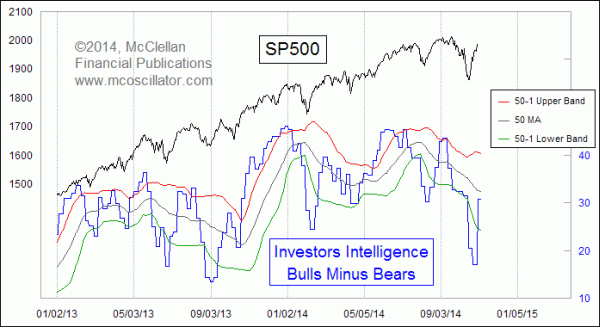
The chart above shows that bull bear spread. Investors Intelligence surveys approximately 200 newsletter writers and investment advisors, and classifies them as either (1) Bullish, (2) Bearish, or (3) “Correction”. The chart above portrays the spread between the percentage of bulls and that of the bears. You may notice that all of the readings for the past 2 years have been positive, meaning that there have been more bulls than bears. We have to go all the way back to 2011 (not shown) to find an instance when the bears outnumbered the bulls, and that was right after a post-QE2 19% decline in the SP500.
Added to that chart above are a set of 50-1 Bollinger Bands. That’s shorthand for saying that the upper and lower bands are each set 1 standard deviation above and below a 50-day simple moving average. One quick and easy way to make use of the Investors Intelligence data is to observe when it goes above the upper band or below the lower band. But excursions outside the bands are not the same going up or going down. Very deep excursions below the lower band tend to mark nice bottoms. But excursions above the upper band often appear early in a price up move. The moment of dropping back down below the upper band is a better sign of a price top.
Investors Intelligence publishes their survey data weekly. There are two separate lags involved. The first is that it takes the subjects of this survey some amount of time to change their opinions on the market based on price action. The second lag comes from the reporting of those changes in opinion to their subscribers, and thus to Investors Intelligence (II), plus II’s own lag in tabulating and publishing their results. So it should be understood that that the II data will lag price movements by some period.
One other point you might notice is that sometimes the weekly change is very small, and other times it is a really big change. To help see that better, this next chart looks at the weekly change in the Bull-Bear spread.
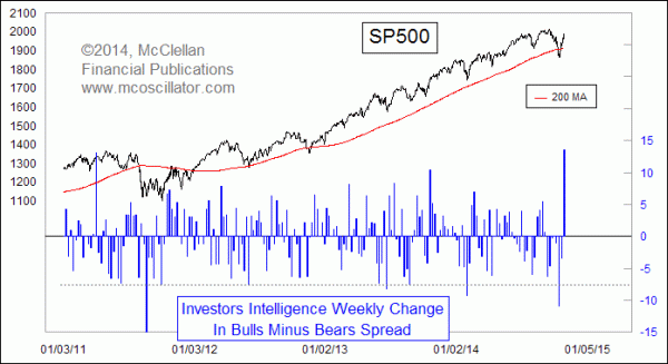
Very low readings usually mark important price lows, like the one we just saw in mid-October, when the Bull-Bear spread fell from 31.4 percentage points to 17.1 in just 2 weeks. But very high readings have a different meaning, or at least that is the case when the market is in an uptrend. The sudden surges toward the bullish side are a sign of strong upward initiation, or at least that is the case when the market is an uptrend. So here is the buried lede: The recent flip back to bullish is a sign of the initiation of a strong new uptrend.
But this interpretation really only works during uptrends. When the stock market is in a downtrend, the data work in a different way. Here is the same weekly change in the Bull-Bear spread, shown from 2007-2011.
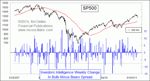
During downtrends, the rapid countertrend rallies tend to climax at the point when the II data shows a big shift back to bullish. High weekly change readings that appear when the SP500 is below its 200-day moving average have a different meaning from the same type of reading seen during an uptrend.
The current market is still arguably in an uptrend, having recovered from a very brief dip below the 200MA. And so the most recent big positive spike in this weekly change indicator should more appropriately be interpreted as a sign of new upward initiation, as opposed to a failing effort during a countertrend rally. That’s a useful piece of information right there.
Tom McClellan
Editor, The McClellan Market Report
Oct 23, 2014
Deflation Is Getting Too Popular |
May 29, 2014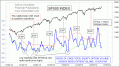
Equity Options vs. Index Options |
Oct 18, 2013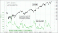
Rydex Money Market Fund Assets Low |