More from Investors Intelligence Data

Free Chart In Focus email
Delivered to you every week
Last week I wrote about a rather unique way to look at the sentiment data from the weekly Investors Intelligence survey. This week, I want to expand on that topic a little bit more, and cover the one piece of data in that weekly report which gets the least attention.
Investors Intelligence surveys over 100 investment advisors and newsletter writers, and categorizes them as either (1) Bullish, (2) Bearish, or (3) “Correction”. That last category is for advisors that are not willing to make a commitment to either a bullish or a bearish stance, and it is the subject of this week’s chart.
For someone to decide to be either bullish or bearish requires some degree of commitment. So the “correction” category in part describes survey subjects who are not willing to make such a commitment.
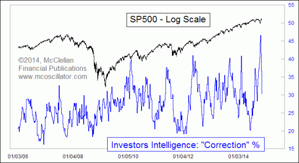
This category is all the more interesting at the moment because 2 weeks ago, Investors Intelligence reported a really high reading for the percentage of survey subjects in the “correction” category. My data go back to 1990, and this is the highest reading in all of that time for this category.
So what does it mean? Looking back at the past few years’ data, the very high readings are typically seen at important price bottoms. That is an important insight for interpreting what the record high reading of 2 weeks ago means. The Ebola scare created not just fear, but also extreme uncertainty. So the high reading serves as a marker to tell us that the Oct. 16, 2014 bottom was an important washout low, and not just a stepping stone on a new trend downward.
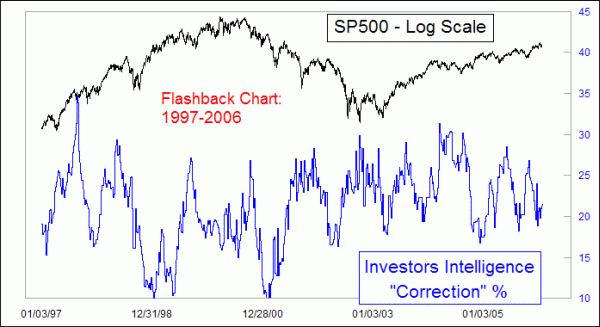
Interestingly, very low readings for the “correction” category do not seem to have a consistent meaning at all. Sometimes they are found at tops, sometimes at bottoms, and sometimes in the middle of a continuing trend. I cannot form a useful hypothesis for what a low reading means for this category. The high readings are much more consistent in terms of indicating moments of extreme trepidation. And this seems to be a persistent behavior; here is a chart from further back in time to show that the low readings back then also did not have a consistent meaning, while high readings pointed to bottoms of some importance.

And the rapid drop in this category since the Ebola scare bottom in October 2014 perhaps suggests that traders and analysts have given up their worry a little bit too quickly. That is not healthy for an uptrend, and so it indicates that a pause in the new uptrend is necessary, just to help store up some more worry as fuel for the uptrend to consume later.
Tom McClellan
Editor, The McClellan Market Report
Oct 30, 2014
Insights from Investors Intelligence Data |
Oct 03, 2014
Commercials Betting On Big Dollar Downturn |
Dec 13, 2012
ETF Float As A Sentiment Indicator |