Traders Like QQQ A Little Too Much

Free Chart In Focus email
Delivered to you every week
Some sentiment indicators work by analyzing what people say, such as polls and sentiment surveys. Others work by analyzing what people actually do, and I tend to like those more.
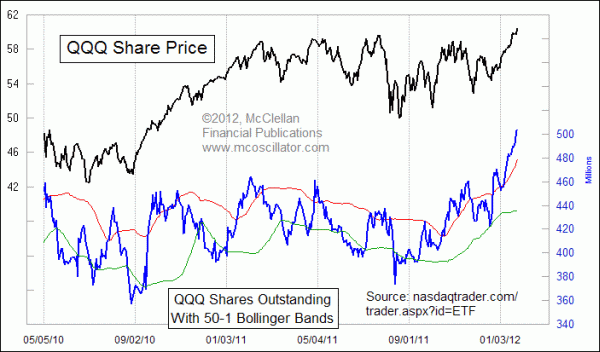
This week's chart looks at investments into QQQ, the ETF designed to track the movements of the Nasdaq 100 Index. The lower line in that chart is the total number of shares outstanding of the QQQ. It fluctuates each day as fewer or more people feel like owning shares. Because of that waxing and waning of interest, the sponsoring firm (Power-Shares) issues or redeems shares to keep the share price close to the NAV.
When the firm issues new shares, it goes out and buys the shares of the NDX component issues to back those ETF shares. Not surprisingly, interest in owning these shares rises and falls along with the overall stock market. When the overall market goes up, that makes more people want to participate.
To help track where “high” and “low” levels are, I added 50-day 1-sigma Bollinger Bands to the chart. That means that the upper and lower bands are drawn one standard deviation above and below the 50-day simple moving average, which is not shown. Other settings for drawing Bollinger Bands could also be used for the same purpose; I just like these because they look about right, and give good insights about an overzealous or disinterested investing public when the shares outstanding number goes outside these bands.
The current number of shares outstanding is not at an all time high, but it is the highest we have seen since all the way back in 2006. And it is way above the upper 50-1 Bollinger Band, indicating that traders and investors are getting a little bit too interested in being invested in the QQQ. That overly bullish sentiment condition begs for at least a short term pullback, to reintroduce people to the idea that stock prices actually CAN go down.
The QQQ and the Nasdaq 100 Index are just now breaking out slightly above their 2011 highs, but interest in owning the QQQ is well ahead of its corresponding highs in 2011. That means that traders have been drawn in to owning this ETF to a degree even greater than what the raw price advance itself would suggest should have happened.
Tom McClellan
Editor, The McClellan Market Report
Feb 04, 2011
Gold ETF Assets |
Apr 09, 2010
Rydex Assets Levels Show Investor Sentiment |
Jul 28, 2011
NDX Stocks Show Troubling Drawdowns |