Using Google Trends To Mark A Price Climax
Free Chart In Focus email
Delivered to you every week
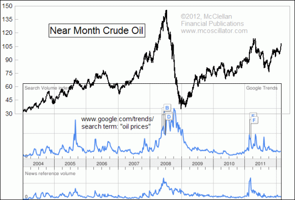
Here's something fun to try. Google offers a free service called Google Trends. You can enter any search term or set of words and get a readout about how that term has been used over time in search patterns as well as news stories. So since oil prices are zooming up and the TV news crews are all talking about higher gasoline prices, I decided to take a look at what Google Trends is showing.
It turns out that people generally, including the news media, are not as excited right now about "oil prices" as a search term or news term as they have been at other times.
To prepare this week's chart, I took the image that the Google Trends service generates, and pasted it onto a chart of crude oil futures prices. A little bit of stretching and fitting was required to get the time periods lined up, but it was nothing too difficult for the state of modern computing capability. It sure beats how we used to have to do this kind of thing years ago, with the enlarge or shrink functions on a photocopy machine with our paper charts.
The upper blue line in Google's chart reflects frequency of searches that people do on the specified term or phrase. The lower line reflects how often that the term gets used in news stories. The alphabetic flags featured on the chart are links to news stories that Google considers to be relevant. Google Trends also offers you the chance to export the results as a Comma Separated Values (CSV) file, so you can take the raw data instead of the image to use in a spreadsheet program.
Looking at the chart comparison, it is not surprising to see that a lot of people were interested in searching or talking about "oil prices" back in 2008. That year's financial crisis led to a commodities blowoff that took oil prices up to a high of $145/barrel. People were also really interested in tracking oil prices as a search and news item in 2011, when the "Arab Spring" protests were having an effect on oil production in the middle east.
It is somewhat surprising now, however, to see that interest has not been picking up in recent weeks. Perhaps there is just a lag between the price changes and people's awareness of it as an interest item. But given that past blowoff moves in oil prices have almost all reached their peak when there was a pickup in search and news interest, the message here is that oil prices are just not yet at the point of reaching a top for the current move.
Oil and other commodities are not the main focus of our newsletter and Daily Edition, but we do like to keep an eye on them, especially insofar as they can have an effect on the stock, bond, or gold markets. In the most recent issue of our twice monthly McClellan Market Report, we took a look at how changes in oil production and consumption are unfolding in the U.S., and at what the current contango situation says about the recent up move continuing.
To see sample issues and subscribe to the McClellan Market Report, visit our Market Reports page.
Tom McClellan
Editor, The McClellan Market Report
Nov 04, 2011
Commodities Not The Diversifier They Once Were |
Jun 24, 2011
Contango Dooms Reason for Strategic Oil Release |
Dec 10, 2010
After The Rogue Wave |