Commodities Not The Diversifier They Once Were
Free Chart In Focus email
Delivered to you every week
Back in early 2008, before the real ugliness in the stock market unfolded, commodities funds became the "hot thing" as hedge funds and other investors chased returns in more exotic places. The argument then was that one should use investments in commodities to diversify away from the risks of stock market investments.
The problem with this idea, then and now, is that a diversified portfolio should invest in non-correlated assets. That way if one asset class falls, the others won't go down with it. And the assumption that commodities are non-correlated to stock prices is one that does not survive contact with the data.
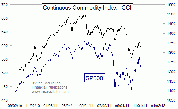
This week's chart shows that commodities prices are very closely correlated with the movements of the stock market. So if one invests in a basket of commodities prices in an effort to get a non-correlated asset, one is making a big mistake. The reality is that their movements are very strongly correlated.
The chart above uses the old CRB Index for comparison to the SP500. That old version is now called the Continuous Commodity Index (CCI, not to be confused with an indicator called the Commodity Channel Index, also CCI). The redesignation followed the 2005 reconfiguration of the CRB Index to more heavily favor energy related futures contracts. That new version actually goes by the full name of "Thomson Reuters/Jefferies CRB Index", but almost no one refers to it by that long version.
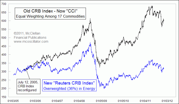
The strong correlation between commodities prices and the SP500 is there regardless of which commodities index one uses. Here we see that the CCI and the new CRB Index may be moving apart in the long run, but their daily and weekly dance steps are almost identical. This is because the components are still largely the same, and just the weightings have been changed.
Perhaps even more interesting than the insight that commodities and stocks are mostly well correlated is the idea that the subtle differences in their behavior may contain useful information. This next chart looks at the 1-month correlation coefficient between the CCI and the SP500.
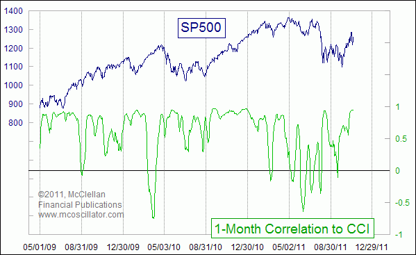
You can see that most of the time it remains well above zero, indicating a strong positive correlation. But every once in a while, the correlation seems to break temporarily, sometimes even plunging below zero. That can be a useful sign that the stock market is trouble, and that volatility is about to pick up due to a temporary illiquidity condition.
In late 2010, the two showed a consistently strong correlation. That lasted all the way until March 2011, when the stock market's advance had slowed and began running into liquidity troubles. Even more significant dips in correlation preceded the big plunge in the stock market during August 2011.
Now in November 2011, the two appear to have returned to a strong positive correlation, implying that liquidity has returned to the financial markets.
Tom McClellan
Editor, The McClellan Market Report
Jan 07, 2011
The Changing Relationship Between Copper and the Stock Market |
Dec 10, 2010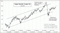
After The Rogue Wave |
Aug 06, 2010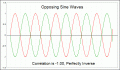
Correlations May Not Be What They Seem |