Bitcoin is a Bubble We’ve Seen Before

Free Chart In Focus email
Delivered to you every week
Most investors remember the 2000 Internet Bubble, which was an example of bubbles for the history books. What is harder is to recognize a replica bubble when it appears again later, especially if it disguises itself.
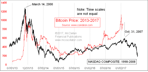
This week’s chart reveals that the price of Bitcoins is replicating the 2000 Nasdaq bubble and its aftermath. But the curious point is that Bitcoin prices are tracing out the dance steps much more quickly. This is a great example of the new and improved “Efficient Market Hypothesis” or EMH. No, it’s not the one you think. The new EMH states that the market now can get a lot more work done in a short time, work that used to take a long time.
An example of the new EMH is the Brexit minicrash, which was a surprise to investors and which two and a half days to play out. It saw a rapid price drop for stock prices, and then a robust rebound. The Nov. 8 election victory of Donald Trump caused a similar upset to the financial markets, but rather than taking two and a half days to play out, the minicrash and rebound unfolded in a single overnight session. The market is getting more efficient.
The price of bitcoins had a bubble top and crash back in late 2013 to early 2014. As a brief review, a bitcoin is a “cryptocurrency”, or a digital asset designed to take the place of money. Bitcoins have only been used as a medium of exchange since 2010. Adherents are attracted to them because of their (supposed) anonymity, and portability without border restriction, or so it has been believed. China’s intrusions into that market have brought that assumption into question.
Bitcoin prices had an initial bubble top in late 2013. This week’s chart compares the history of bitcoin prices since mid-2013 to the pattern made by the Nasdaq Composite from 1998-2008. As noted in the chart, the time scales here are not equal. It appears that bitcoin prices are tracing out the double-bubble dance steps seen in the Nasdaq, but the Bitcoin prices are doing so much more quickly.
The time scales are not equal in this comparison. So I had to do a little bit of chart trickery to create this image. Most charting programs that allow two data series to be displayed together in one chart want equal numbers of data points for each data series. To get around that, and allow the resemblance to be visible, I actually created two charts with transparent backgrounds, and then overlaid one upon the other, like two pieces of acetate used for overhead transparencies (remember those?). Then a little bit of accordion style stretching and repositioning allowed the pattern correlation to be revealed.
Assuming that this correlation continues into the future, bitcoins are going to arrive in a few days at the equivalent of the Oct. 31, 2007 top in the Nasdaq. And shortly thereafter, they should see an echo of the 2008 bear market (again, assuming that the correlation continues).
So if you are “holding” any Bitcoins (not that anyone can actually hold something so ethereal), your moment to exit and flee is rapidly approaching.
Tom McClellan
Editor, The McClellan Market Report
Jun 03, 2011
Silver Is Tracing Out 1980 Post-Bubble Pattern |
Jul 17, 2009
Panics We Have Seen Before |
Jan 12, 2017
Stock Market Still Following Path of 4 Years Ago |