Bumpy vs Smooth
Free Chart In Focus email
Delivered to you every week
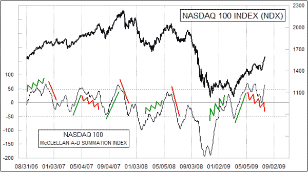
One of the important indications that we can take from indicators like Price Oscillators or A-D Summation Indices is about the strength or weakness of a move.
Today's chart of the Summation Index for the stocks in the Nasdaq 100 Index is a great case in point. The general rule is that a smooth move up or down implies strength for that direction, while bumpy moves imply weakness. Using this rule requires a bit of visual chart interpretation concerning what makes for a bumpy move or a smooth move, and it is not always easy to make such determinations. But when it is clear, as with the highlighted examples in this chart, there is a powerful message there about the strength of the trend.
Coming off of the March 2009 price low, we have seen a smooth up move in this Summation Index. Since May 2009, we have seen a bumpy down move. Smooth up implies strength for the bulls, even though such strength might be on hold for a time to allow the rally to correct. A bumpy down move like the one we have just seen means that the bears are disorganized and not likely to seize control in a meaningful way.
It is not always as easy as this to interpret the structure of the bumps (or lack of them) on a Summation Index. Back in 2007, we saw a smooth up, and then a smooth down after a divergent top (higher prices, lower Summation Index). That would have been hard to interpret in real time, but we can now see that 2007 marked an important transition of control. The bumpiness (or lack) in the Summation Index was trying to give us that message. This Summation Index has now turned up right at its zero line. The NYSE’s A-D Summation Index is turning up well above its zero line. For now, the bulls can be presumed to be in control of the larger trend, until we start to see a divergent top develop and/or signs that the bulls' strength is beginning to wane.
Tom McClellan
Editor, The McClellan Market Report