Credit Spreads Tell A Story
Free Chart In Focus email
Delivered to you every week
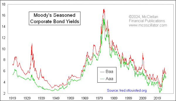
It should not be a surprise that lower quality corporate bonds pay a higher yield than the best quality ones. Investors will pay a premium for better quality, and that drives down the yields on investment grade corporate bonds. Junkier ones have to pay higher yields in order to attract investors.
This week's lead chart shows a comparison between the average yields on bonds rated as Aaa (investment grade) by Moody's, and Baa which are described by Moody's as being "subject to moderate credit risk". As one might expect, both of these types of bond yields tend to move up and down together, as demand for credit (or lack of demand) affects bonds of all types. So the fact that they tend to move up and down together is not at all remarkable.
Where the fun insight comes in is from looking at the spread between these two, known as a "credit spread". The amount of the difference between high quality and lesser quality bond yields tends to vary over time, depending on liquidity conditions and other supply/demand factors. This next chart looks at that spread.
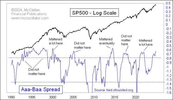
A couple of points are worth explaining before I get to the analysis. I am portraying the spread here as the raw percentage point spread between Aaa and Baa yields. This math presumes that the difference between 10% and 11% is the same as the difference between 4% and 5% yields, and that presumption is arguably problematic. But trying to find a better way to portray such differences is also problematic.
I also have shown it as a spread between the lower yielding Aaa and the higher yielding Baa, which results in negative numbers for the spread. Doing it this way is helpful because it results in a better correlation to what stock prices are doing. But the numbers can be confusing this way, which is why I am emphasizing this mathematical point.
Now to the fun part, the analysis. As of November 26, 2024, the average Aaa bond yield is at 5.11% and the Baa yield is at 5.73. The difference is -0.62 percentage points, which is a pretty small difference historically. Saying it another way, investors seem pretty content right now to accept the higher risks involved with lower quality bond offerings, which is narrowing the spread.
That higher confidence can be a sign of a price top for the stock market, but not always. This chart shows that if we ever see a really large spread (deep negative numbers), that is a reliable sign of a bottom for stock prices. A large spread like that means that there are big liquidity problems, affecting not just corporate bonds but also stocks. And when liquidity gets tight, the movement of this spread indicator can get really steep, i.e. it can quickly go from a small spread to a painful one. But it can also steeply move back again, as liquidity gets restored and spreads moderate.
So big spreads are easy to interpret. But small spreads like we have right now are not as easy. Sometimes they are amazing markers of price tops for the stock market. Other times, they do not seem to matter.
The key lesson, therefore, is that just because you see a tight credit spread (like what we are seeing now), and just because that means there is a lot of investor complacency, that does not mean it has to result in a big stock market decline right away. It can mean that, but it does not have to mean that.
So what good is looking at this relationship if it does not work consistently? Good question. First, it does work consistently for marking stock market bottoms when the credit spreads get really wide. And second, it is important for us to know that sometimes indications are not reliable. If someone tells you, "Credit spreads are narrow, and that means _____," what I want to achieve is for you to be skeptical of that assertion, and for you to go ask the data if it really does mean that.
Tom McClellan
Editor, The McClellan Market Report
Nov 01, 2024
Bond Yields Foretell Polling Data |
Jun 20, 2024
Yield Curve’s 15-Month Lag |
Oct 21, 2021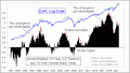
Treasury-Bund Yield Spread Shows Troubling Divergence |