Flattening Phase of Yield Curve Cycle
Free Chart In Focus email
Delivered to you every week
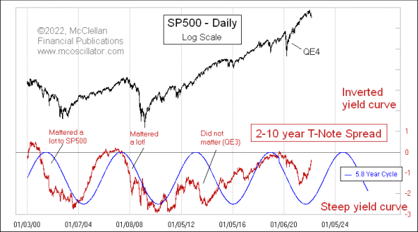
Economists fear an inverted yield curve, because of its historical tendency to be a harbinger of a coming recession. But when it comes to the stock market, a steepening yield curve is the more problematic condition.
This week’s chart looks at one representation of the entire yield curve, comparing the 2-year T-Note yield to the 10-year. The entire yield curve consists of yields of various maturities all along the spectrum, but that is hard to portray in its entirety on a two-dimensional chart.
Here 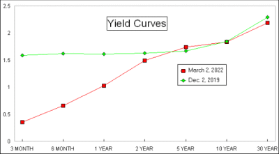 is a chart with examples of a steep yield curve, and a flat one, just as an illustration. A “steep” yield curve (red plot in the inset chart) means that short term rates are much lower than long term ones. A “flat” yield curve like the green plot in this example has short and long term yields roughly equal.
Often a 2-member comparison like the 2-10 spread has the longer yield first, so a comparison of the 10-year to the 2-year yields would be expressed as a “10-2 spread”. But to make a better comparison to the behavior of stock prices, I have inverted that in this week's lead chart to show it as a 2-10 spread.
One of the fun aspects of analyzing the yield curve is that there is a 5.8-year cycle that has been operating for several years, and which is included in the lead chart. This cycle has stumbled a little bit in recent years, during which the Fed has had at least two thumbs on the scale. But this cycle’s relationship to the 2-10 spread goes back at least to the mid-1980s. It was not as reliable before then as it is now; the hyperinflation of the late 1970s may have disrupted that cycle’s manifestation.
I have no idea why the 5.8-year period length is meaningful for this cycle. If it was a 4-year cycle, we could tie it to the Presidential Cycle. If it was an 11-year cycle, we could link it to sunspots, maybe. The market does not always reveal all of its secrets. Even if we cannot identify the “why” of this cycle’s length, we can at least validate that it does seem relevant, most of the time. It is not a requirement to understand why a market phenomenon happens in order to use it to our advantage.
The yield curve was supposed to be in a steepening phase from 2019-2022, and it did its best to accommodate that mandate. Steepening yield curve phases are generally not good periods for the stock market, at least most of the time. When the Fed decides to poke its nose into the market’s business, normal functions get disrupted.
The steepening yield curve in 2000-2004 mattered a lot for the stock market. So did the steepening period in 2006-2010, although the Fed got the stock market to bottom early by starting QE1 in 2009. By the time this 5.8-year cycle was due to top in 2013, the Fed was thoroughly manipulating everything it could, disrupting both the 2-10 spread’s compliance with this cycle and the SP500’s relationship to it.
Under Jerome Powell’s leadership, the Fed has been trying to figure out how to wean the banking system and the stock market off of the Fed’s stimulus, thus far without great success. I do not envy them that challenge.
The 5.8-year cycle bottomed in mid-2021, and the 2-10 spread bottomed a few months early in March 2021 at the point of maximum yield curve steepness. Now that spread is rising, just as the cycle says should be happening, meaning a flattening of the yield curve due to last into 2024.
Oh No!!! Not a flattening yield curve!! That will worry the economists. But remember that it is the inverted yield curve that is the problem for GDP. The process of flattening all the way to inversion is actually a pretty bullish condition for stocks, historically speaking. And that process is due to last until around mid-2024, roughly speaking. That should mean a bullish phase for the stock market.
The problem is that the Fed may have pulled forward a bunch of those supposed gains by pumping too much money into the system to solve the problems of the federal government’s Covid lockdown and associated difficulties. The stock market may have to chop sideways in post-QE purgatory for a few years in order to make penance for those crimes of overstimulation. And the 2-10 spread can continue on its flattening trajectory, probably at a slower place, all the way to that mid-2024 cycle peak.
After mid-2024, the 2-10 spread is supposed to start steepening again, which should make the economists happy. A steepening yield curve means no recession ahead, but the harsh truth is that this phenomenon results because the recession is already behind. Steepening yield curves happen when the Fed is aggressively cutting short term rates, and the Fed does that when there are times of economic trouble.
Those stimulative efforts are great for the stock market, eventually, but the period of the steepening yield curve is generally not a good time to be a bullish stock investor unless you have a Fed which is willing to throw tons of money at the problem. They can only do that so many times before their efforts lose effectiveness, and we may already be at that point.
So, what do we look for? A generally favorable time for stock prices until 2024, which will unfortunately be mitigated and diminished by the gains already pulled forward by the Fed trying to fix things. And then starting in mid-2024, the stock market is in for a pretty difficult time. The Fed can attempt to fight this; they have been doing that for several years now. But the cycle is what it is, and the Fed’s powers extend only so far.
Tom McClellan
Editor, The McClellan Market Report
Sep 19, 2019
Yield Curve and Small Caps |
Feb 26, 2021
Yield Curve Steepening, and Small Caps |
Dec 10, 2021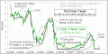
2-Year Yield Putting Pressure on Fed to Raise Rates |