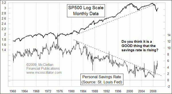
Is a Higher Savings Rate a GOOD Thing?
Free Chart In Focus email
Delivered to you every week
One of the effects of the real estate collapse and economic slowdown has been that Americans are saving more. Economists have long complained about the shrinking savings rate, as Americans for years used increasing levels of debt to fuel their consumption, and thus fuel the economy. So a return to a higher savings rate ought to be good news, since it means we are personally not going rapidly into debt (the government's debt is another story).
That is the simplified theory, but real life is a lot more dynamic. This week's chart looks at the Personal Savings Rate, which is calculated and tabulated by the Department of Commerce. You can see the raw data at the St. Louis Fed's website. The savings rate is compared to the SP500, which is shown on a logarithmic scale. You can see that the general decline in the savings rate during the 1980s and 1990s matches up nicely with the general rise in the SP500.
Stocks got into trouble in the 2000s when the savings rate reached such a low level that it could not decline any more. The breaking of the downtrend line for the savings rate matches the breaking of the long term uptrend line for stock prices. If consumers are indeed returning permanently to a 5% personal savings rate, then we are likely to see stock prices also staying horizontal like they did through the 1960s and 1970s.
In the long run, having people storing up wealth now should give them the ability one day to unleash that stored energy to fuel the economy, and push stock prices higher. That is what happened after the 1982 stock market low. But if those thrifty savers are planning to invest their savings in the stock market, then paradoxically the plan won't work in terms of generating returns on those savings. Until we see consumers give up this newfound thriftiness, all that the market and the economy can do is mount a bounceback, as opposed to real long-term growth.
Tom McClellan
Editor, The McClellan Market Report
Jul 17, 2009 Panics We Have Seen Before |
Sep 18, 2009 Old Nikkei 225 Chart Pattern Has Story To Tell For Today |