


McClellan Oscillator Quietest in Years
Free Chart In Focus email
Delivered to you every week
I wrote last week about how the very quiet breadth data were producing a low reading on the Fosback Absolute Breadth Indicator. That low reading is consistent with a topping condition for prices.
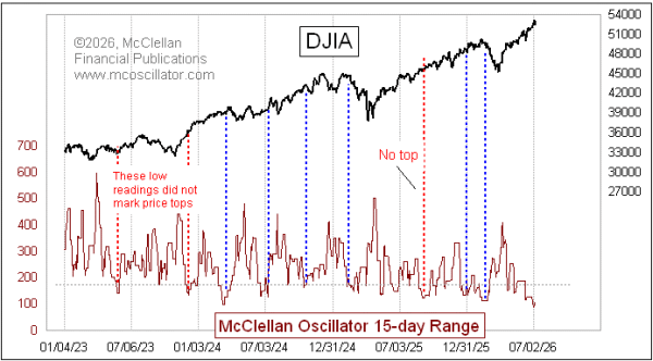
The same message appears in a different way in this week's chart. The NYSE's McClellan A-D Oscillator has been hanging around very close to the zero level, producing the lowest reading in years for its 15-day range. This too is consistent with a topping condition for prices, although this indicator has its share of failing indications.
The blue dashed lines in the chart above highlight instances when low readings for the McClellan Oscillator 15-day range marked great price tops. The red ones highlight the failures. But even in failures there can be important information. If an uptrend won't stop for a top-worthy indicator reading, it is probably a really strong uptrend, and it is worth hanging on when you find yourself in one of those.
But strong uptrends typically reveal themselves by showing big positive readings for the McClellan Oscillator. You can get a small 15-day range indication at any level, provided that the Oscillator stays there. What is important about the current low reading is that it is appearing as the Oscillator is staying quiet and very close to zero. So there is no strong initiation indication.
This is not the only type of indication of a quiet market. The VIX is back down to a low level. Bollinger Bands on price charts are pinching in, which is another way of saying that the standard deviation of closing prices has been falling. Quiet markets more typically happen at price tops, when everyone is feeling like a genius for being invested, and no one sees potential troubles brewing. Price bottoms, on the other hand, are louder and more chaotic. Or at least that is how it works in the stock market. Interestingly gold works the opposite way, with quiet rounded bottoms and violent spiky tops. It all has to do with the nature of panic. People panic out of stocks and into cash. But they panic out of cash and into gold, making those spikes appear in the price charts.
Tom McClellan
Editor, The McClellan Market Report
Mar 06, 2024
Quiet McClellan Oscillator |
Jun 11, 2026
Complex McClellan Oscillator Structure Below Zero |
Jun 26, 2026
Fosback Absolute Breadth Shows a Quiet Market |